states <- as.data.frame(state.x77) |>
  rename(life_exp = `Life Exp`, hs_grad = `HS Grad`) |>
  mutate(inc1000 = Income / 1000,
state = rownames(as.data.frame(state.x77)))12 Interactions
We’re going to use a new variable, income, in addition to the ones we’ve been using so far. We will convert it into inc1000, or the per capita income in thousands of (1974) USD.
12.1 Simple and additive models
Let’s start with an additive model of life_exp as a function of hs_grad and inc1000:
\[\text{LIFEEXP}_i = \beta_0 + \beta_1(\text{HSGRAD}_i) + \beta_2(\text{INCOME}_i) + \varepsilon_i\]
Or we could write it as:
\[\begin{align} \text{LIFEEXP}_i &\sim \mathcal{N}(\mu_i, \sigma) \\ \mu_i &= \beta_0 + \beta_1(\text{HSGRAD}_i) + \beta_2(\text{INCOME}_i) \end{align}\]
No matter how we write it, we estimate it like this.
additive <- lm(life_exp ~ hs_grad + inc1000, data = states)

msummary(additive, gof_map = c("nobs", "r.squared"))| (1) | |
|---|---|
| (Intercept) | 65.881 |
| (1.235) | |
| hs_grad | 0.100 |
| (0.025) | |
| inc1000 | -0.073 |
| (0.330) | |
| Num.Obs. | 50 |
| R2 | 0.340 |
Interpret this table. Think about confidence intervals among other things.
12.1.1 Regression lines at representative values
Now let’s look at some predictions. We’ll set up a grid for the plot, do some predictions, then plot them. This is a pretty common plotting workflow.
hs_seq <- seq(min(states$hs_grad), max(states$hs_grad), length.out = 100)
income_levels <- quantile(states$inc1000, c(0.1, 0.5, 0.9))

add_grid <- expand.grid(hs_grad = hs_seq, inc1000 = income_levels)
add_grid$fit <- predict(additive, newdata = add_grid)
add_grid$income <- factor(round(add_grid$inc1000, 1))plt(fit ~ hs_grad | income, data = add_grid, type = "l", lwd = 2,
xlab = "% finishing high school", ylab = "Predicted life expectancy")
ggplot(add_grid, aes(x = hs_grad, y = fit, linetype = income)) +
  geom_line(linewidth = 1) +
  labs(x = "% finishing high school", y = "Predicted life expectancy",
       linetype = "Income")
So we set the x-axis to hs_grad and the y-axis to predicted life_exp, showing different values of inc1000 using three different lines. Interpret this graph. How does it relate to the table above? Note that the lines are parallel, which is what “additive” means.
Of course, we could have plotted the same model a different way.
Data prep
# these are the three values of HS
myhs <- quantile(states$hs_grad,
                 c(0, .5, 1))

# this is the x-axis
myincs <- seq(min(states$inc1000),
              max(states$inc1000),
              length = 100)

# combine the values
xgrid <- expand_grid(inc1000 = myincs,
                     hs_grad = myhs)

# get the predictions
yhat <- predict(additive,
                newdata = xgrid,
                interval = "confidence",
                level = .89)

# stick everything together and label the lines
preds <- bind_cols(as.data.frame(yhat), xgrid) |>
  mutate(hs_rate = case_when(hs_grad == min(states$hs_grad) ~ "min",
                             hs_grad == max(states$hs_grad) ~ "max",
.default = "median"))Show code
plt(fit ~ inc1000 | hs_rate,
    data = preds,
    type = "l",
    ymax = upr,
    ymin = lwr,
    lw = 2,
    main = "Predicted life expectancy",
    sub = "Additive model, 89% CIs",
    ylab = "Life expectancy",
    xlab = "Per capita income ($1000s)",
    legend = legend(title = "HS Grad %"))
plt_add(type = "ribbon")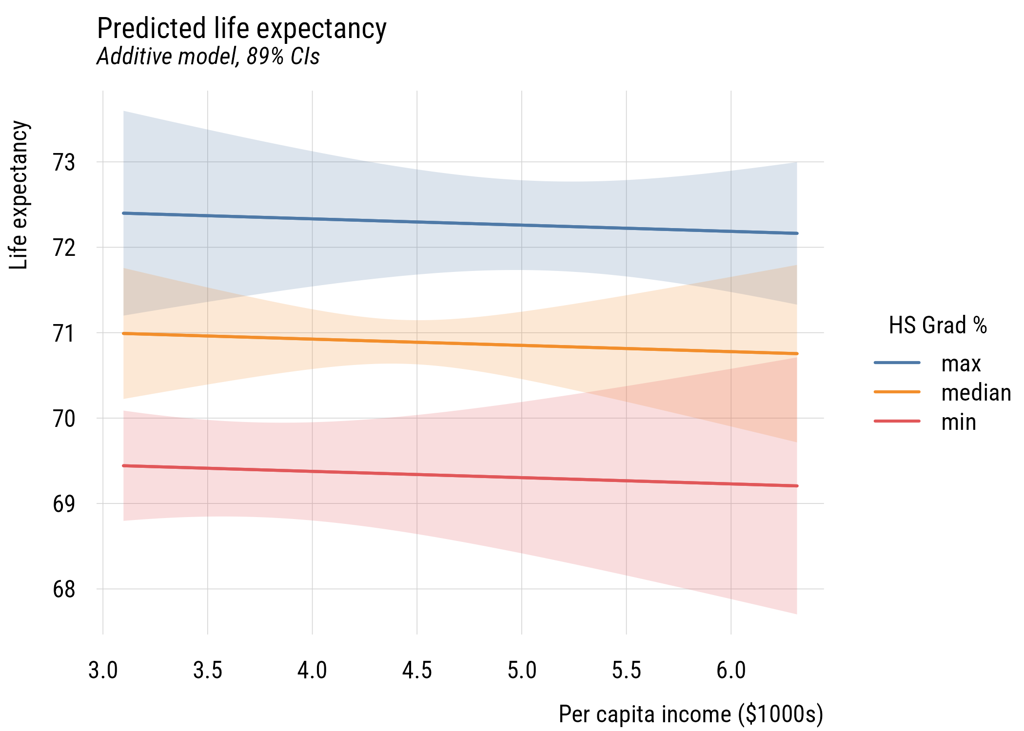
Show code
ggplot(preds, aes(x = inc1000, y = fit, color = hs_rate, fill = hs_rate)) +
  geom_ribbon(aes(ymin = lwr, ymax = upr), alpha = 0.2, color = NA) +
  geom_line(linewidth = 1) +
  labs(
    title = "Predicted life expectancy",
    subtitle = "Additive model, 89% CIs",
    y = "Life expectancy",
    x = "Per capita income ($1000s)",
    color = "HS Grad %",
    fill = "HS Grad %")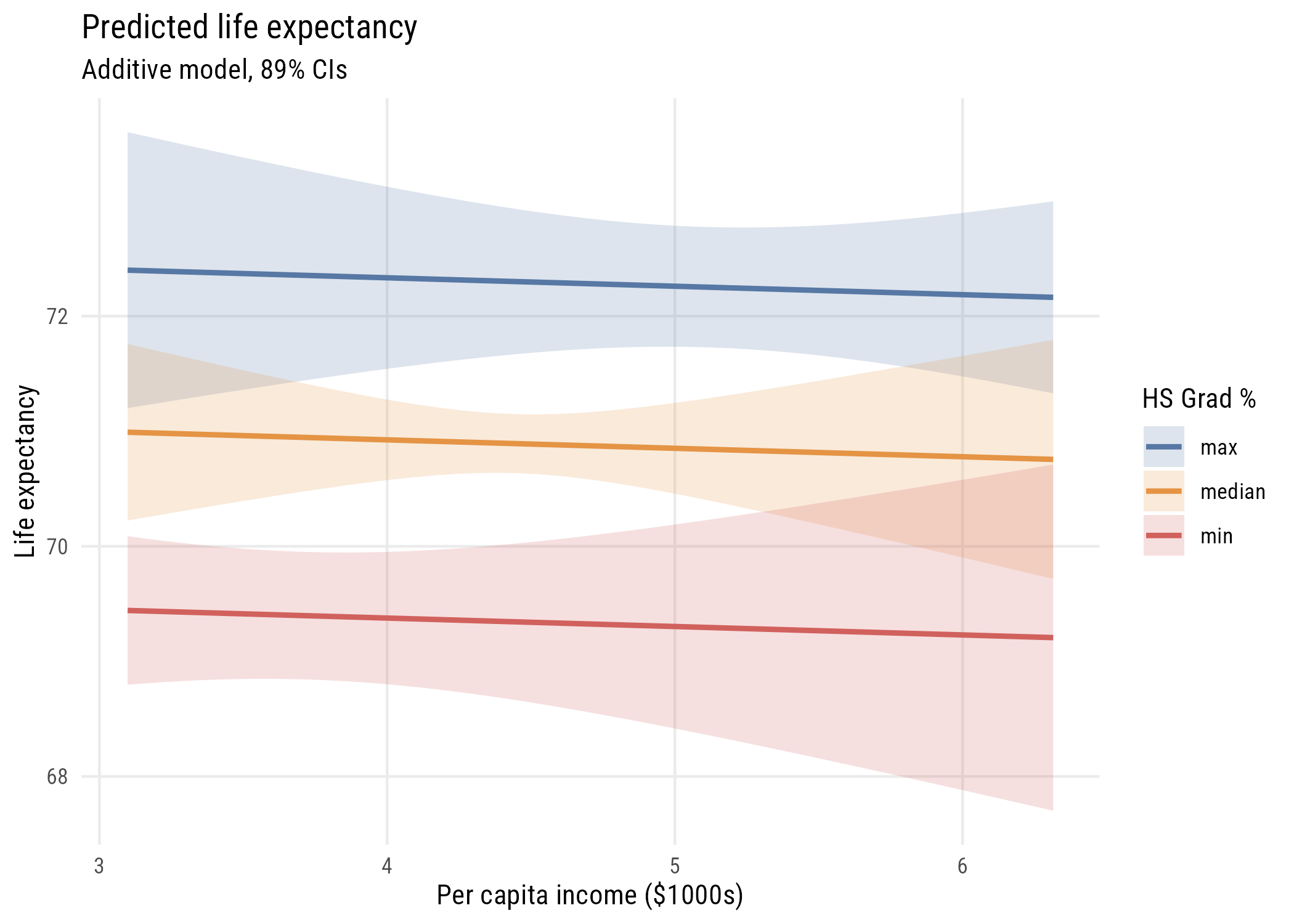
How does this differ?
12.1.2 Perspective plots
We’ve seen this type of plot before but let’s take another look.
Show code
# simplify names
x <- states$hs_grad
y <- states$inc1000
z <- states$life_exp

# set up grid
gx <- seq(min(x), max(x), length = 50)
gy <- seq(min(y), max(y), length = 50)

grid <- expand_grid(hs_grad = gx,
                    inc1000 = gy)

# get predictions in matrix form
Z <- matrix(predict(additive,
                    newdata = grid),
            nrow = length(gx),
            ncol = length(gy))

# padding
zlim <- range(c(z, Z))
pad  <- diff(zlim) * 0.05
zlim <- zlim + c(-pad, pad)

# graph
pmat <- persp(
  x = gx, y = gy, z = Z,
  theta = 45, phi = 15,
  zlim = zlim,
  xlab = "HS grad %", ylab = "Inc ($1000s)", zlab = "Life expectancy",
  ticktype = "simple"
)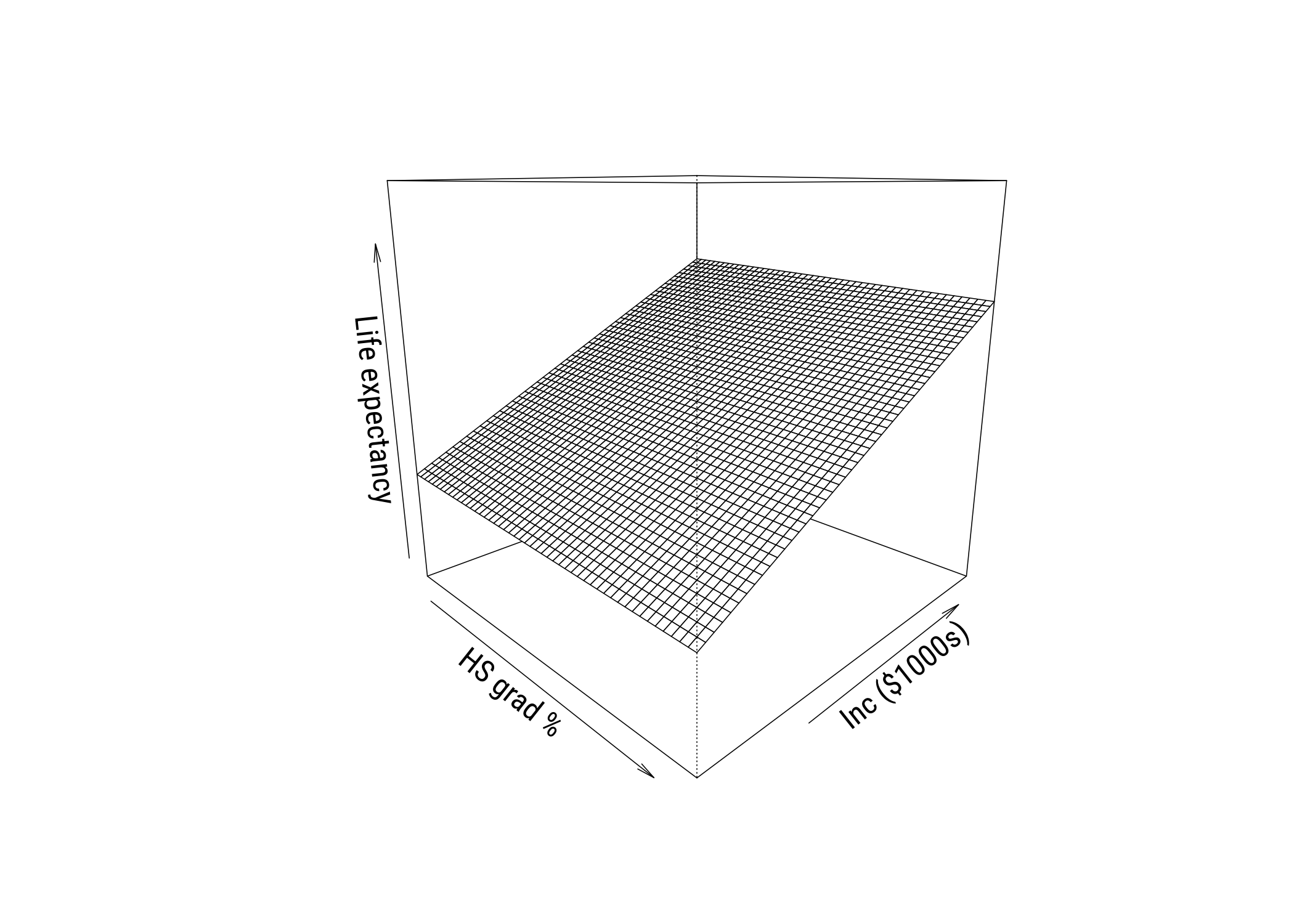
These are cool to look at but you don’t see real 3D plots much in the real world in my experience.
12.1.3 Heatmaps
The final thing we’ll look at is a heatmap. We could hack this together in {tinyplot} but we really should be using {ggplot2} here.
Show code
# get predictions to plot
grid <- expand_grid(
  hs_grad = seq(min(states$hs_grad), max(states$hs_grad), length = 50),
  inc1000 = seq(min(states$inc1000), max(states$inc1000), length = 50)) |>
  mutate(life_exp_pred = predict(additive, newdata = pick(everything())))

# make the graph
ggplot() +
  geom_tile(
    data = grid,
    aes(x = hs_grad,
        y = inc1000,
        fill = life_exp_pred)) +
  geom_point(
    data = states,
    aes(x = hs_grad, y = inc1000),
    color = "black", size = 1.5) +
  ggrepel::geom_text_repel(
    data = states,
    aes(x = hs_grad,
        y = inc1000,
        label = state),
    family = book_font,
    size = 3) +
  scale_fill_distiller(
    palette = "RdYlBu",
    direction = -1,
    name = "Predicted\nlife exp.") +
  labs(
    x = "HS grad %",
    y = "Income ($1000s)",
    title = "Predicted life expectancy") +
  theme(panel.grid = element_blank())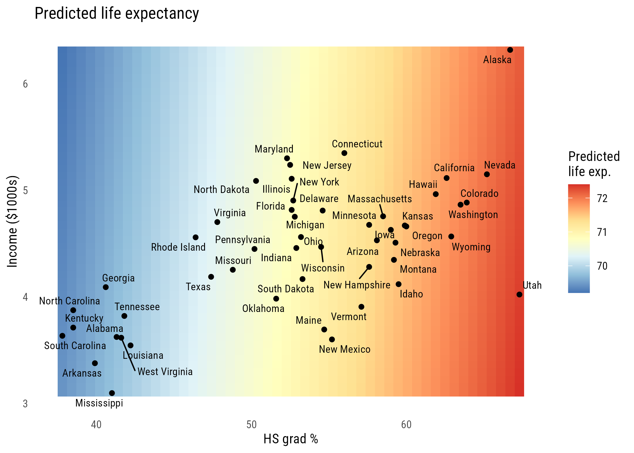
You can see the hs_grad gradient is pretty big and the inc1000 gradient is mild at best.
12.2 Interactions between predictors
These models so far have assumed that the effects of hs_grad and inc1000 are additive effects. That is, that the marginal effect of each on the outcome doesn’t depend on the value of the other variable. We can change that!
12.2.1 Estimation and interpretation of the interaction model
Here’s the interaction model:
\[\text{LIFEEXP}_i = \beta_0 + \beta_1(\text{HSGRAD}_i) + \beta_2(\text{INCOME}_i) + \beta_3(\text{HSGRAD}_i)(\text{INCOME}_i) + \varepsilon_i\]
The hs_grad * inc1000 notation is a shorthand for hs_grad + inc1000 + hs_grad:inc1000, where hs_grad:inc1000 means \((\text{HSGRAD}_i)(\text{INCOME}_i)\).
interactive <- lm(life_exp ~ hs_grad * inc1000, data = states)

msummary(interactive, gof_map = c("nobs", "r.squared"))| (1) | |
|---|---|
| (Intercept) | 44.446 |
| (6.022) | |
| hs_grad | 0.498 |
| (0.112) | |
| inc1000 | 5.151 |
| (1.473) | |
| hs_grad |
-0.096 |
| (0.026) | |
| Num.Obs. | 50 |
| R2 | 0.486 |
int_grid <- expand.grid(hs_grad = hs_seq, inc1000 = income_levels)
int_grid$fit <- predict(interactive, newdata = int_grid)
int_grid$income <- factor(round(int_grid$inc1000, 1))plt(life_exp ~ hs_grad, data = states, type = "p", pch = 19, cex = 0.6,
xlab = "% finishing high school", ylab = "Life expectancy (years)")
for (i in seq_along(income_levels)) {
lines(hs_seq, int_grid$fit[int_grid$inc1000 == income_levels[i]],
lwd = 2, lty = i)
}
legend("bottomright", legend = paste("income", round(income_levels, 1)),
lty = seq_along(income_levels), lwd = 2, bty = "n")
ggplot(states, aes(x = hs_grad, y = life_exp)) +
  geom_point(size = 1) +
  geom_line(data = int_grid, aes(y = fit, linetype = income), linewidth = 1) +
  labs(x = "% finishing high school", y = "Life expectancy (years)",
       linetype = "Income")
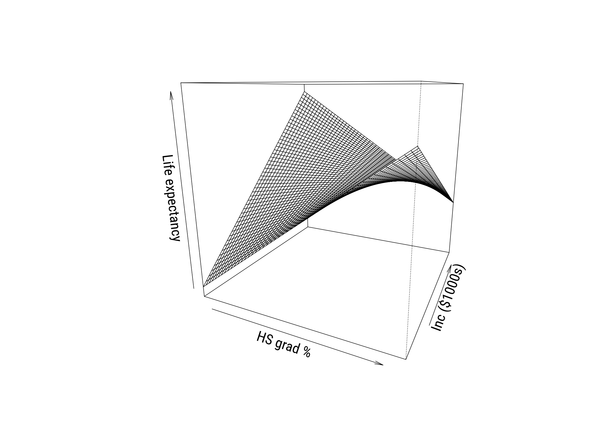
As you can see, the slope of hs_grad appears to depend very strongly on the value of inc1000!
We can look at it in the other ways we’ve seen so far as well. Such as the perspective plot…
Show code
# simplify names
x <- states$hs_grad
y <- states$inc1000
z <- states$life_exp

# set up grid
gx <- seq(min(x), max(x), length = 50)
gy <- seq(min(y), max(y), length = 50)

grid <- expand_grid(hs_grad = gx,
                    inc1000 = gy)

# get predictions in matrix form
Z <- matrix(predict(interactive,
                    newdata = grid),
            nrow = length(gx),
            ncol = length(gy))

# padding
zlim <- range(c(z, Z))
pad  <- diff(zlim) * 0.05
zlim <- zlim + c(-pad, pad)

# graph
pmat <- persp(
  x = gx, y = gy, z = Z,
  theta = 25, phi = 15,
  zlim = zlim,
  xlab = "HS grad %", ylab = "Inc ($1000s)", zlab = "Life expectancy",
  ticktype = "simple"
)
And the heatmap…
Show code
# get predictions to plot
grid <- expand_grid(
  hs_grad = seq(min(states$hs_grad), max(states$hs_grad), length = 50),
  inc1000 = seq(min(states$inc1000), max(states$inc1000), length = 50)) |>
  mutate(life_exp_pred = predict(interactive, newdata = pick(everything())))

# make the graph
ggplot() +
  geom_tile(
    data = grid,
    aes(x = hs_grad,
        y = inc1000,
        fill = life_exp_pred)) +
  geom_point(
    data = states,
    aes(x = hs_grad, y = inc1000),
    color = "black", size = 1.5) +
  ggrepel::geom_text_repel(
    data = states,
    aes(x = hs_grad,
        y = inc1000,
        label = state),
    family = book_font,
    size = 3) +
  scale_fill_distiller(
    palette = "RdYlBu",
    direction = -1,
    name = "Predicted\nlife exp.") +
  labs(
    x = "HS grad %",
    y = "Income ($1000s)",
    title = "Predicted life expectancy") +
  theme(panel.grid = element_blank())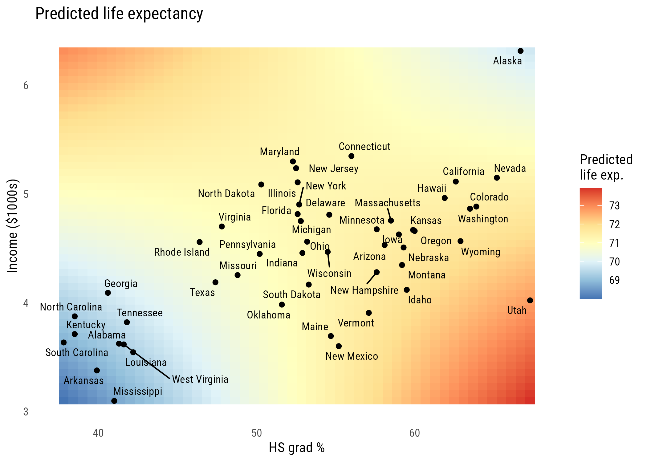
All three of these ways of visualizing tell the same story of a relationship that’s not fully additive.1
1 Looking at these graphs, the reason the interactions are helping might really be down to Alaska and Utah. We probably won’t talk too much about outliers in this chapter (there’s enough to do already) but I’d look a lot closer in this case. If you drop those two states, the interaction coefficient falls from -0.096 to -0.07 and its p-value goes from 0.00073 to 0.08.
12.2.2 Model comparisons
Let’s compare the additive (C or \(M_1\)) and interactive (A or \(M_2\)) models. First let’s look at the \(F\)-test comparison.
anova(additive, interactive)Analysis of Variance Table
Model 1: life_exp ~ hs_grad + inc1000
Model 2: life_exp ~ hs_grad * inc1000
Res.Df RSS Df Sum of Sq F Pr(>F)
1 47 58.306
2 46 45.375 1 12.931 13.109 0.0007296 ***
---
Signif. codes: 0 '***' 0.001 '**' 0.01 '*' 0.05 '.' 0.1 ' ' 1This is called an incremental \(F\) test. The null hypothesis is that adding the additional term (here, the interaction) does not improve model fit.
As discussed in Chapter 9, we can also use a test based on comparing the likelihoods. This is the likelihood ratio test (LRT). The reason I point this out here is because the LRT can be used for many kinds of models, not just linear regressions.
g2 <- 2 * (as.numeric(logLik(interactive)) - as.numeric(logLik(additive)))

c(G2 = g2, p_LRT = 1 - pchisq(g2, df = 1),
  p_F = anova(additive, interactive)$`Pr(>F)`[2])
G2 p_LRT p_F
1.253735e+01 3.988980e-04 7.295974e-04 This test gives a smaller p-value because the tail of the \(\chi^2\) distribution is thinner than the tail of the \(F\) distribution with one numerator and 46 denominator degrees of freedom. These get more similar as the sample size goes up.
12.2.3 Tests of other parameters
Let’s look again at the output from Model 2. You get some null hypothesis tests here but it’s important to remember what they mean in the presence of interactions. Let’s start with the linear terms:
- the
hs_gradnull hypothesis is now “the slope ofhs_gradis 0 wheninc1000is 0” - the
inc1000null hypothesis is now “the slope ofinc1000is 0 whenhs_gradis 0”
When we have an interaction, the so-called “main effects” reflect the slope when its interaction partner is set to 0. If you think about it, the related null hypothesis tests are essentially meaningless since neither inc1000 nor hs_grad is ever 0. So you can’t talk about whether either of those coefficients is “statistically significant” on its own.
The interaction term coefficient reflects two things at once:
- how the
hs_gradslope changes wheninc1000goes up by 1 unit - how the
inc1000slope changes whenhs_gradgoes up by 1 unit
The null hypothesis here is that the slopes don’t change at different levels of the other variable. So that’s a meaningful null hypothesis test regardless of how the variables are coded.
12.2.4 Deviating or centering predictors
One way to make the linear terms more interpretable is to make sure that the variables all have meaningful zero values. We can do that several different ways, for example normalization (where zero means “minimum”) or standardization (where zero means “the mean”). Perhaps the most straightforward way to do this is to center the variables at their means. This way the units are the same (e.g., percentage points, thousands of dollars) but 0 is now the mean.
states <- states |>
  mutate(hs_c  = hs_grad - mean(hs_grad),
         inc_c = inc1000 - mean(inc1000))

centered <- lm(life_exp ~ hs_c * inc_c, data = states)

msummary(centered, gof_map = c("nobs", "r.squared"))| (1) | |
|---|---|
| (Intercept) | 71.167 |
| (0.162) | |
| hs_c | 0.073 |
| (0.024) | |
| inc_c | 0.067 |
| (0.297) | |
| hs_c |
-0.096 |
| (0.026) | |
| Num.Obs. | 50 |
| R2 | 0.486 |
Now, for example, the hs_c coefficient means “the predicted difference in life_exp when hs_grad goes up a point and inc1000 is at its mean.”
Notice that \(R^2\) and the interaction coefficient are exactly the same as before. Only the linear terms changed. The interaction’s p-value didn’t change either:
c(uncentered = coef(summary(interactive))["hs_grad:inc1000", "Pr(>|t|)"],
  centered   = coef(summary(centered))["hs_c:inc_c", "Pr(>|t|)"])
uncentered centered
0.0007295974 0.0007295974 12.3 A general procedure for the derivation of “simple” slopes
The slope of one predictor depends on its own value as well as the value of any variables it’s interacted with. For our model, the slope of hs_grad at a given income is:
\[b_1 + b_3 \times \text{income}\]
b <- coef(interactive)

data.frame(
  income = round(income_levels, 2),
  hs_grad_slope = round(b["hs_grad"] + b["hs_grad:inc1000"] * income_levels, 4)
)
income hs_grad_slope
10% 3.62 0.1507
50% 4.52 0.0649
90% 5.12 0.0076Sometimes we want a single number instead, like the average slope across all the states in the data.
avg_slopes(interactive, variables = "hs_grad")
 Estimate Std. Error    z Pr(>|z|)   S  2.5 % 97.5 %
   0.0729     0.0236 3.08  0.00204 8.9 0.0266  0.119

Term: hs_grad
Type: response
Comparison: dY/dX
In a model like this, the average marginal effect is the same as the slope when income is at its mean, which is also the same as the hs_c coefficient in the centered model:
c(avg_slope = as.data.frame(avg_slopes(interactive, variables = "hs_grad"))$estimate,
  slope_at_mean = unname(b["hs_grad"] + b["hs_grad:inc1000"] * mean(states$inc1000)),
  centered_main_effect = unname(coef(centered)[2]))
avg_slope slope_at_mean centered_main_effect
0.07288519 0.07288519 0.07288519 12.4 Powers of predictor variables
Adding a polynomial term essentially means allowing a variable to interact with itself.
ImportantNo interaction without a plot
I just want to emphasize an important rule: no interaction without a plot. And because even a polynomial is an interaction, that also requires a plot.
We saw some plots above so I won’t go over how to make them again. But here are some tools for calculating marginal effects in complex models.
plot_predictions(interactive, condition = c("hs_grad", "inc1000"),
                 conf_level = .89) +
  labs(title = "Effects of HS grad rate at levels of income",
       x = "HS graduation %",
       y = "Predicted Life Expectancy")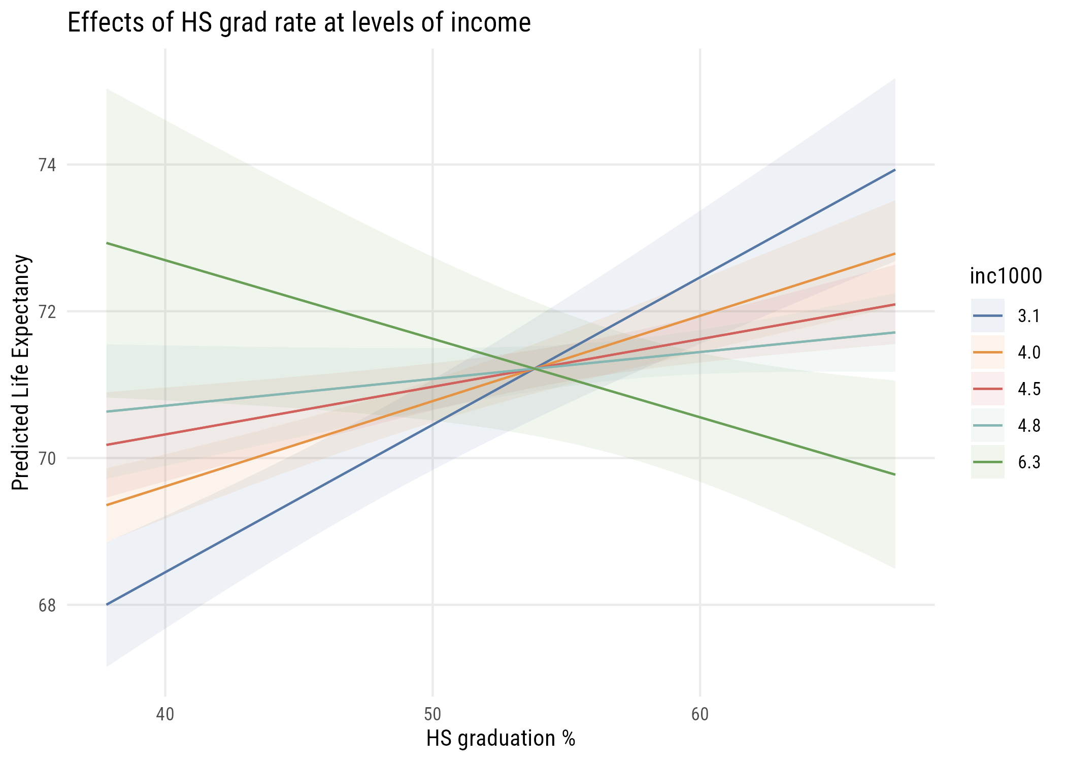
avg_slopes(interactive, variables = "inc1000")
 Estimate Std. Error     z Pr(>|z|)   S  2.5 % 97.5 %
   0.0667      0.297 0.225    0.822 0.3 -0.515  0.648

Term: inc1000
Type: response
Comparison: dY/dX
Here’s an example with a polynomial. Let’s look at how TV watching varies by age, and whether that’s different for men and women.
tv_age <- readRDS(here::here("data", "gss2024.rds")) |>
  haven::zap_labels() |>
  select(tvhours, sex, age) |>
  tidyr::drop_na()

degrees <- 1:5

data.frame(
  degree = degrees,
  parameters = map_int(degrees, \(k)
    length(coef(lm(tvhours ~ poly(age, k) * factor(sex), data = tv_age)))),
  R2 = map_dbl(degrees, \(k)
    round(summary(lm(tvhours ~ poly(age, k) * factor(sex), data = tv_age))$r.squared, 4)),
  AIC = map_dbl(degrees, \(k)
    round(AIC(lm(tvhours ~ poly(age, k) * factor(sex), data = tv_age)), 1)),
  BIC = map_dbl(degrees, \(k)
    round(BIC(lm(tvhours ~ poly(age, k) * factor(sex), data = tv_age)), 1))
)
degree parameters R2 AIC BIC
1 1 4 0.0395 10865.0 10893.2
2 2 6 0.0482 10850.0 10889.5
3 3 8 0.0506 10848.6 10899.4
4 4 10 0.0516 10850.5 10912.6
5 5 12 0.0578 10840.8 10914.2\(R^2\) goes up with every degree (of course!). AIC prefers the fifth-degree curve, but BIC prefers the second-degree curve. That’s because BIC has a bigger penalty for extra parameters, as we saw in Chapter 10. When they disagree, I’d usually go with the simpler model, so here’s the quadratic:
quad <- lm(tvhours ~ poly(age, 2) * factor(sex), data = tv_age)

pred_age <- predictions(quad, newdata = datagrid(age = 18:89, sex = c(1, 2))) |>
  as.data.frame() |>
mutate(sex = factor(sex, levels = c(1, 2), labels = c("Male", "Female")))plt(estimate ~ age | sex, data = pred_age, type = "l", lwd = 2,
xlab = "Age", ylab = "Predicted hours of television")
ggplot(pred_age, aes(x = age, y = estimate, linetype = sex)) +
  geom_line(linewidth = 1) +
  labs(x = "Age", y = "Predicted hours of television", linetype = "")
12.5 Power considerations
You can skim this section. Interesting but not essential.
People often say that you need about four times as many people to detect an interaction as to detect a main effect. That’s roughly right, but not because there’s anything special about interaction tests. With the same effect size, an interaction test has about the same power as any other coefficient. The problem is that interaction effects are usually smaller than the main effects. In the simulation below, the interaction is half as big as the main effects.
set.seed(522)

one_study <- function(n) {

  d <- tibble(
    x1 = rnorm(n),
    x2 = rnorm(n)
  ) |>
    mutate(y = 0.3 * x1 + 0.3 * x2 + 0.15 * x1 * x2 + rnorm(n))

  p <- coef(summary(lm(y ~ x1 * x2, data = d)))[, 4]

  tibble(
    main        = p["x1"]    < 0.05,
    interaction = p["x1:x2"] < 0.05
  )

}

expand_grid(
  sid = 1:800,
  n = c(100, 200, 400, 800)
) |>
  rowwise() |>
  mutate(out = list(one_study(n))) |>
  unnest_wider(out) |>
  group_by(n) |>
  summarize(across(c(main, interaction), \(z) round(mean(z), 3)),
            .groups = "drop")
# A tibble: 4 x 3
n main interaction
<dbl> <dbl> <dbl>
1 100 0.805 0.306
2 200 0.989 0.539
3 400 1 0.839
4 800 1 0.988If an effect is half as big, you need about four times as many people to detect it. This is the square root rule from Chapter 2 again.
12.6 Recap
- an additive model assumes each predictor’s slope is the same at every value of the other, so its lines are parallel
- an interaction adds the product of two predictors, and
*is shorthand for both terms plus their product - in an interaction model the “main effects” are the slope when the partner is 0, so their null hypothesis tests are essentially meaningless unless zero means something
- centering fixes that
- the interaction’s own test is meaningful regardless of coding
- the incremental F test compares additive against interactive, and the LRT does the same job for other kinds of models
- a polynomial is a variable interacting with itself
- no interaction without a plot
- interactions are hard to detect mainly because they’re small