The goal of this chapter is to introduce Poisson regression and show how it can be used to analyze contingency table data.1
1 It makes sense to me to introduce Poisson right after categorical by categorical interactions because it allows us to think about the analysis of contingency tables.
Count variables are discrete (integers) and positive numeric variables. We count things like speeding tickets, friends, published papers, visitors to a coffee shop in an hour, or even income (dollars per year).
We will use the 2024 GSS data to illustrate.
d <-readRDS(here::here("data", "gss2024.rds")) |> haven::zap_labels() |>select(tvhours, degree, sex) |>drop_na() |>mutate(sex =factor(sex,labels =c("M", "F")), # sex as a factordegree_fac =factor(degree,labels =c("none", "HS", "AA", "BA", "grad")))nrow(d)
[1] 2144
17.1 The Poisson distribution
You are, of course, familiar with the normal distribution. That’s the one we’ve been using the whole semester.
The Poisson distribution is a different distribution that is often used for count outcomes—that is, for integer variables that can’t go below zero.
Unlike the normal distribution, which assigns a probability density to all the real numbers from \(-\infty\) to \(\infty\), the Poisson distribution is a discrete probability distribution that assigns a finite probability to all positive integers using a probability mass function.
Here’s the formula, though you probably won’t find it too useful yet.
Unlike the normal distribution, which has two parameters (\(\mu\) and \(\sigma\)), the Poisson distribution just has one parameter: \(\lambda\). This number governs the shape of a given Poisson distribution and is both its mean and the variance. It also assumes that events are independent, meaning that one event doesn’t make future events more likely.
plt(prob ~ x |factor(lambda),data = poisson_values,type ="b",xlab ="k",ylab ="P(X = k)",ylim =c(0, .35),lw =2,xaxb =seq(0, 16, 2),grid =FALSE,legend =legend("topright", title =expression(lambda)),main ="Poisson example PMFs")
Figure 17.1: Poisson example PMFs.
Show code
ggplot(poisson_values, aes(x = x, y = prob, color =factor(lambda))) +geom_line() +geom_point() +scale_x_continuous(breaks =seq(0, 16, 2)) +ylim(0, .35) +labs(x ="k", y ="P(X = k)", color =expression(lambda),title ="Poisson example PMFs")
Figure 17.2: Poisson example PMFs.
Even though the formula might look daunting at first, it’s pretty easy to find the probability of a certain count given a value of \(\lambda\). For example, if we ask “what’s the probability of having 5 job interviews if the mean number of interviews is 3.5 and the distribution follows a Poisson distribution?” we can do this:
(3.5^5*exp(-3.5)) /factorial(5)
[1] 0.1321686
…which tells us that there’s an 13.2% chance of getting exactly 5 interviews.
We could also get that this way:
dpois(5, 3.5)
[1] 0.1321686
Or ask what is the probability of more than 5:
ppois(5, 3.5, lower.tail =FALSE)
[1] 0.1423864
You get the idea.
TipTake a moment
What’s the probability of getting exactly 3 visitors to a coffee shop in an hour if \(\lambda = 3\) visitors per hour?
17.1.1 Modeling data
Before looking at predictors, we can think about how a variable could be modeled using the Poisson. First, let’s look at the unconditional distribution of tvhours in the GSS data.
Data prep
counts <- d |>count(tvhours) |>complete(tvhours =0:24, fill =list(n =0))
Figure 17.5: A Poisson distribution with lambda set to the sample mean.
Show code
ggplot(pois_dist, aes(x = k, y = prob)) +geom_col() +scale_x_continuous(breaks =seq(0, 24, 2)) +labs(x ="k", y ="prob")
Figure 17.6: A Poisson distribution with lambda set to the sample mean.
You can see that the modeled version is a simplified version of the empirical distribution. It doesn’t have as much probability mass out at the right tail, for example. It really doesn’t think that anyone is very likely to watch, say, 20 hours of TV per day.
Assumptions take us away from the data, but it’s often worth it! Here we’re describing 25 different counts with just one number.
17.1.2 Comparison to the normal distribution
We can compare the Poisson distribution of tvhours to a normal distribution with the mean and variance estimated from the data.
Data prep
mu <-mean(d$tvhours)sigma <-sd(d$tvhours)# cleaning up empirical distributionempirical_dist <- counts |>mutate(prob = n /nrow(d)) |>rename(k = tvhours) |>complete(k =-6:24, fill =list(prob =0))# getting theoretical distributionsdistributions <-tibble(k =-6:24,prob_Normal =dnorm(k, mu, sigma),prob_Poisson =dpois(k, mu))# adjusting prob dens so it sums to 1 (it's already close)normsum <-sum(distributions$prob_Normal)# reshaping long for plottingdistributions <- distributions |>mutate(prob_Normal = prob_Normal / normsum) |>pivot_longer(starts_with("prob"),names_to ="dist",values_to ="prob",names_prefix ="prob_")
Figure 17.7: Normal and Poisson descriptions of tvhours, against the observed distribution in gray.
Show code
ggplot() +geom_segment(data = empirical_dist,aes(x = k, xend = k, y =0, yend = prob),linewidth =3, color ="gray", alpha = .5) +geom_line(data = distributions, aes(x = k, y = prob, color = dist)) +geom_point(data = distributions, aes(x = k, y = prob, color = dist), size =1) +scale_x_continuous(breaks =seq(-6, 24, 2)) +ylim(0, .24) +labs(x ="k", y ="prob", color ="Distribution")
Figure 17.8: Normal and Poisson descriptions of tvhours, against the observed distribution in gray.
You can see that two distributions estimated on the same data allocate the probability mass in very different places, with the normal putting a lot of it below zero (which is technically impossible of course).
The Poisson isn’t perfect either. It doesn’t expect as many low values or high values as there actually are. This is because the Poisson assumes that the mean and variance of the distribution are the same. But in the empirical distribution, the mean is 3.3 and the variance is 10.9. It is actually common for empirical count data to be overdispersed relative what the Poisson expects.2
2 There are many things that lead to overdispersion, including different subpopulations (e.g., old and young), clustering (e.g., watching an hour of TV makes watching another hour more likely), and excess zeros (maybe some people have no chance of watching any TV). There are ways to address these issues (like negative binomial regression and zero-inflated Poisson) but I’m already on too big of a tangent.
We could compare the likelihoods of these two distributions.
norm_tv <-lm(tvhours ~1, data = d)pois_tv <-glm(tvhours ~1, data = d, family =poisson())logLik(norm_tv)
'log Lik.' -5603.863 (df=2)
logLik(pois_tv)
'log Lik.' -5589.428 (df=1)
Even using only one parameter, the Poisson does a better job of fitting the unconditional empirical distribution.
17.2 Models with predictors
Of course we are usually going to want to create models with predictors. We can write a Poisson model with one predictor like this:
All of the ways of writing nudge you toward different intuition.
17.2.1 Doing it manually
We’ve seen how to solve for parameters like this before. Here’s the mean number of siblings for people who go to religious services weekly and for everyone else:
# A tibble: 2 x 2
  church numsibs
  <chr>    <dbl>
1 weekly    3.36
2 less      2.81
Just as in Chapter 16, we don’t have the model, we have the result of an unknown model. The only difference is that now the link is the log instead of the logit, so we solve \(2.81 = e^{\alpha}\) and \(3.36 = e^{\alpha + \beta}\):
means <- sibs |>group_by(church) |>summarize(m =mean(sibs)) |>pull(m, name = church)alpha <-log(means["less"])beta <-log(means["weekly"]) - alphac(alpha =unname(alpha), beta =unname(beta))
Call:
glm(formula = tvhours ~ sex, family = poisson(), data = d)

Coefficients:
            Estimate Std. Error z value Pr(>|z|)
(Intercept)  1.16678    0.01815   64.28   <2e-16 ***
sexF         0.04995    0.02401    2.08   0.0375 *
---
Signif. codes:  0 '***' 0.001 '**' 0.01 '*' 0.05 '.' 0.1 ' ' 1

(Dispersion parameter for poisson family taken to be 1)

    Null deviance: 5472.7  on 2143  degrees of freedom
Residual deviance: 5468.4  on 2142  degrees of freedom
AIC: 11179

Number of Fisher Scoring iterations: 5
From this we see that female respondents report watching 1.051 times more TV than male respondents. Exponentiating \(\beta\) gives the incidence-rate ratio, or the percent change in the expected count.
TipChallenge!
Fit glm(tvhours ~ college, family = poisson()) where college is 1 for a bachelor’s degree or more. According to that model, what is the probability that someone with (and without) a college degree watches 4 or more hours of TV per day?
(Hint: you’ll need dpois() and the fitted \(\lambda\) for each group.)
17.2.3 Overdispersion strikes
The summary() output also suggests that this difference is “statistically significant” at the .05 level. But we have to be careful here. Remember that the Poisson assumes that the mean and variance of the distribution are the same. But since the data are likely overdispersed (as we discussed above), the standard errors are probably actually bigger than estimated.
We can estimate correct standard errors using the code below. This is a “robust” SE because it’s robust (among other things) to a violation of the assumption that (conditional) mean and variance are the same.
lmtest::coeftest(m1,vcov = sandwich::vcovHC(m1, type ="HC3"))
z test of coefficients:

            Estimate Std. Error z value Pr(>|z|)
(Intercept) 1.166782   0.032851 35.5173   <2e-16 ***
sexF        0.049953   0.043608  1.1455    0.252
---
Signif. codes:  0 '***' 0.001 '**' 0.01 '*' 0.05 '.' 0.1 ' ' 1
We can see that the robust standard error is quite a bit larger. This reminds me of part of a funny haiku by Keisuke Hirano:
T-stat looks too good.
Use robust standard errors—
Significance gone.
WarningUse robust standard errors
With the regular Poisson standard errors, the sex difference in TV watching is “statistically significant.” With robust standard errors, it isn’t. If the data are overdispersed, the Poisson standard errors will be too small. Count data are almost always overdispersed, so use robust standard errors by default (or use a model that estimates the dispersion, like the negative binomial).
17.3 Why not just log the outcome?
You’ll see this a lot in published work: people take a count, add a small number to it, log it, and then run a regular regression. They add the small number because log(0) is undefined and counts often include zeros.
So we can’t log tvhours without adding something first. But what should we add? People usually pick 1, .1, or .01, and it seems like it shouldn’t matter much. But it does!
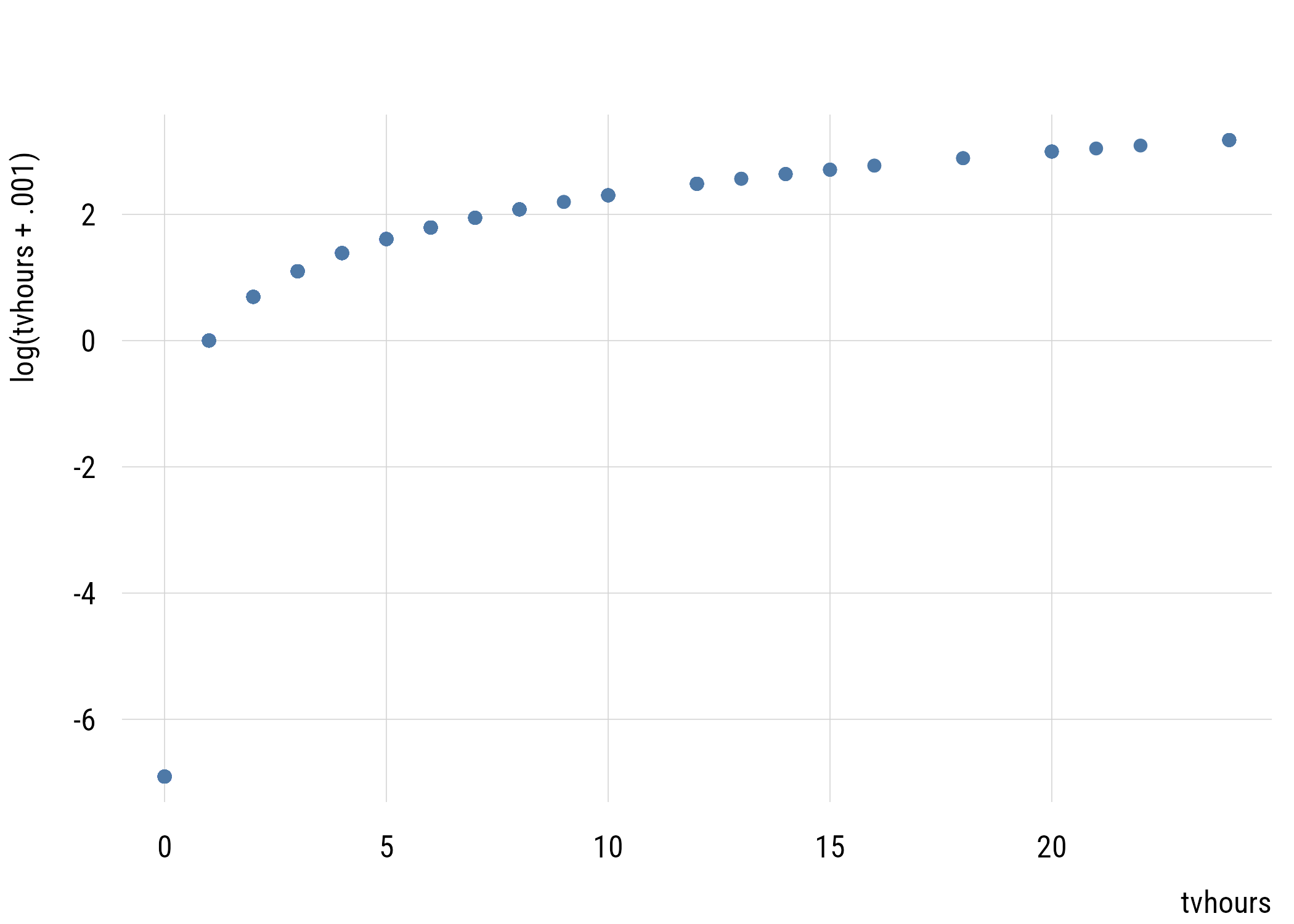
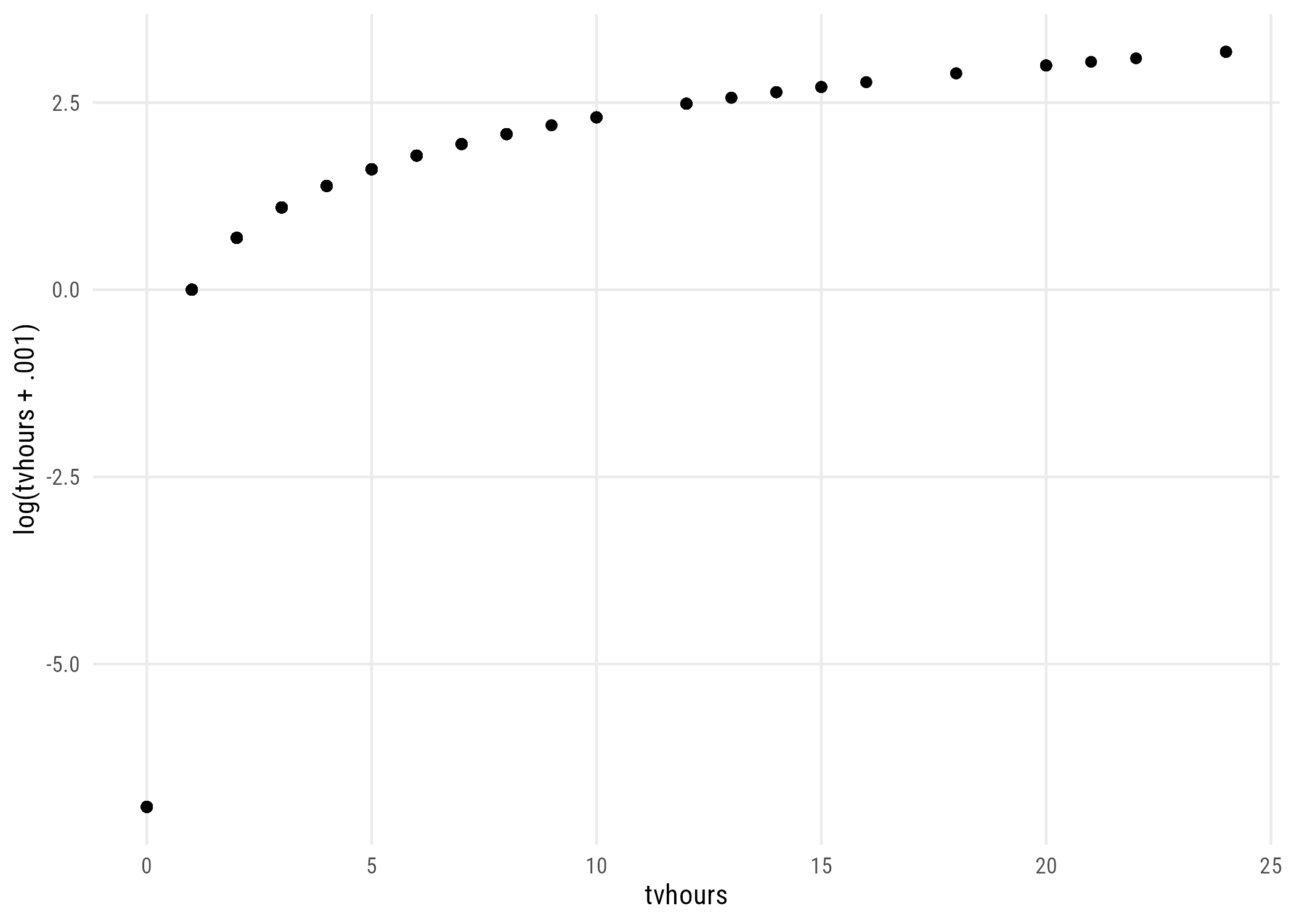
The data are exactly the same, but the estimated effect of education changes a lot. That’s because of what the transformation does to the zeros. With a constant of .001, everyone who watches no TV ends up at -6.9, which is really far below someone who watches one hour.
Figure 17.9: What adding .001 and logging does to tvhours.
Show code
ggplot(d, aes(x = tvhours, y = weirdtv)) +geom_point() +labs(x ="tvhours", y ="log(tvhours + .001)")
Figure 17.10: What adding .001 and logging does to tvhours.
My advice: just say no. Use a count model instead! The Poisson model uses the log without having to add anything, because the log is in the link function. It applies to the expected count, not to the individual zeros.
17.4 Family and link are separate choices
Remember that a GLM has two parts that you can choose separately: the family (the distribution of the outcome) and the link (how the linear predictor connects to the mean of that distribution). We’ve been using poisson() with its default log link, but we don’t have to.
Show code
m_log <-glm(tvhours ~ degree, data = d, family =poisson())m_identity <-glm(tvhours ~ degree, data = d, family =poisson(link ="identity"))m_gaussian <-glm(tvhours ~ degree, data = d, family =gaussian(link ="identity"))data.frame(model =c("Poisson, log link", "Poisson, identity link", "Gaussian, identity"),coefficient =round(c(coef(m_log)[2], coef(m_identity)[2], coef(m_gaussian)[2]), 4),logLik =round(c(as.numeric(logLik(m_log)),as.numeric(logLik(m_identity)),as.numeric(logLik(m_gaussian))), 1))
                   model coefficient  logLik
1      Poisson, log link     -0.1560 -5460.4
2 Poisson, identity link     -0.4857 -5461.3
3     Gaussian, identity     -0.4913 -5565.3
The last model is just OLS. A Gaussian family with an identity link is exactly what lm() does! So all the models earlier in the book were GLMs too; we just didn’t call them that. The link changes what a coefficient means (multiplicative with the log link, additive with the identity link). In this case, though, the family matters more than the link, since both Poisson models fit a lot better than the Gaussian one.
17.5 Models for tables
OK now with all this in hand we can finally get back to thinking about how models can be tables. Remember this?
Show code
xtab <- d |>tabyl(sex, degree_fac)xtab
 sex none  HS  AA  BA grad
   M   66 471  66 212  130
   F  117 516 120 260  186
What if instead we reshaped it into dataframe like this so that it has 10 rows?
Show code
dcounts <- d |>summarize(freq =n(),.by =c(degree_fac, sex)) |>arrange(sex, degree_fac)dcounts
# A tibble: 10 x 3
   degree_fac sex    freq
   <fct>      <fct> <int>
 1 none       M        66
 2 HS         M       471
 3 AA         M        66
 4 BA         M       212
 5 grad       M       130
 6 none       F       117
 7 HS         F       516
 8 AA         F       120
 9 BA         F       260
10 grad       F       186
We can now model the count of cases in each cell (freq) as some function of the two categorical variables, degree_fac and sex.
Let’s build up slowly. Think about what the model below would mean.
It assumes that freq would be the same in all 10 cells. We can confirm this as follows:3
3 We have to specify option type = "response" in the predict() function because without it we’ll get the prediction in log counts because that’s how the model thinks. This option says “we want it in the original units.”
dcounts <- dcounts |>mutate(pred_null =predict(tm_null, type ="response"))dcounts
# A tibble: 10 x 4
   degree_fac sex    freq pred_null
   <fct>      <fct> <int>     <dbl>
 1 none       M        66      214.
 2 HS         M       471      214.
 3 AA         M        66      214.
 4 BA         M       212      214.
 5 grad       M       130      214.
 6 none       F       117      214.
 7 HS         F       516      214.
 8 AA         F       120      214.
 9 BA         F       260      214.
10 grad       F       186      214.
This model would allow the male and female cells to have different counts:
dcounts <- dcounts |>mutate(pred_sex =predict(tm_sex, type ="response"))dcounts
# A tibble: 10 x 5
   degree_fac sex    freq pred_null pred_sex
   <fct>      <fct> <int>     <dbl>    <dbl>
 1 none       M        66      214.     189.
 2 HS         M       471      214.     189.
 3 AA         M        66      214.     189.
 4 BA         M       212      214.     189.
 5 grad       M       130      214.     189.
 6 none       F       117      214.     240.
 7 HS         F       516      214.     240.
 8 AA         F       120      214.     240.
 9 BA         F       260      214.     240.
10 grad       F       186      214.     240.
This is a little better but not matching freq very well! Let’s add degree also:
tm_both <-glm(freq ~ sex + degree_fac,data = dcounts,family =poisson())
dcounts <- dcounts |>mutate(pred_both =predict(tm_both, type ="response"))dcounts
# A tibble: 10 x 6
   degree_fac sex    freq pred_null pred_sex pred_both
   <fct>      <fct> <int>     <dbl>    <dbl>     <dbl>
 1 none       M        66      214.     189.      80.7
 2 HS         M       471      214.     189.     435.
 3 AA         M        66      214.     189.      82.0
 4 BA         M       212      214.     189.     208.
 5 grad       M       130      214.     189.     139.
 6 none       F       117      214.     240.     102.
 7 HS         F       516      214.     240.     552.
 8 AA         F       120      214.     240.     104.
 9 BA         F       260      214.     240.     264.
10 grad       F       186      214.     240.     177.
This is closer but not quite there. Why? Because it assumes that sex can affect the number of people in a cell and degree can affect the number of people in a cell but they don’t influence each other’s effects! Let’s take a closer look:
summary(tm_both)
Call:
glm(formula = freq ~ sex + degree_fac, family = poisson(), data = dcounts)

Coefficients:
               Estimate Std. Error z value Pr(>|z|)
(Intercept)     4.39024    0.07782  56.414  < 2e-16 ***
sexF            0.23806    0.04350   5.473 4.43e-08 ***
degree_facHS    1.68518    0.08048  20.938  < 2e-16 ***
degree_facAA    0.01626    0.10412   0.156    0.876
degree_facBA    0.94749    0.08708  10.881  < 2e-16 ***
degree_facgrad  0.54626    0.09289   5.881 4.09e-09 ***
---
Signif. codes:  0 '***' 0.001 '**' 0.01 '*' 0.05 '.' 0.1 ' ' 1

(Dispersion parameter for poisson family taken to be 1)

    Null deviance: 968.245  on 9  degrees of freedom
Residual deviance:  17.065  on 4  degrees of freedom
AIC: 98.797

Number of Fisher Scoring iterations: 4
This model says that cells from female respondents have 0.238 more log respondents in them. If we exponentiate that, we see that female cells have 1.27 times more respondents in them compared to the corresponding male cell. You can confirm that by comparing the predictions above.
This is the same as assuming independence—that education and sex have nothing to do with each other. These predictions are the same as the expected values in the \(\chi^2\)-test at the end of Chapter 15.
Note that this model only uses 6 degrees of freedom—intercept, female dummy, four education dummies—to represent a table with 10 cells. So it’s an attempt to approximate 10 numbers with 6 numbers.
We can get the full table—what we call the saturated model—by allowing the factors to interact:
tm_sat <-glm(freq ~ sex * degree_fac,data = dcounts,family =poisson())
dcounts <- dcounts |>mutate(pred_sat =predict(tm_sat, type ="response"))dcounts
# A tibble: 10 x 7
   degree_fac sex    freq pred_null pred_sex pred_both pred_sat
   <fct>      <fct> <int>     <dbl>    <dbl>     <dbl>    <dbl>
 1 none       M        66      214.     189.      80.7     66.0
 2 HS         M       471      214.     189.     435.     471.
 3 AA         M        66      214.     189.      82.0     66.0
 4 BA         M       212      214.     189.     208.     212.
 5 grad       M       130      214.     189.     139.     130.
 6 none       F       117      214.     240.     102.     117.
 7 HS         F       516      214.     240.     552.     516.
 8 AA         F       120      214.     240.     104.     120.
 9 BA         F       260      214.     240.     264.     260.
10 grad       F       186      214.     240.     177.     186.
You can see that the model “predictions” are exactly the same as the data. This is because we used 10 parameters to recover 10 cell counts.
If we compare the saturated model to the independence model, we are asking the same question as the old-school \(\chi^2\) test.4
4 As the sample goes to infinity, the likelihood ratio\(\chi^2\) test and the Pearson’s \(\chi^2\) test are the same. But in finite samples, we have to use Rao’s score test to get the exact same values from anova().
anova(tm_both, tm_sat, test ="Rao")
Analysis of Deviance Table

Model 1: freq ~ sex + degree_fac
Model 2: freq ~ sex * degree_fac
  Resid. Df Resid. Dev Df Deviance    Rao Pr(>Chi)
1         4     17.065
2         0      0.000  4   17.065 16.893 0.002027 **
---
Signif. codes:  0 '***' 0.001 '**' 0.01 '*' 0.05 '.' 0.1 ' ' 1
What do we get out of this? Everything a model gives you that a test doesn’t: coefficients, confidence intervals, the ability to add more predictors, and comparisons with AIC and BIC.
17.6 An example from the literature
These loglinear models for tables were actually super important for sociology in the 1970s and 1980s. You don’t see them much anymore, but here is a 2006 example.
Loglinear models are most useful when you have three or more variables, because then there’s more than one way for the variables to be related.
For example, all three could be independent, or one pair could be associated but not the others, or all three pairs could be associated. Each of these is a model, and we can compare each one to the saturated model (the one that reproduces the table exactly).
                            model df     G2     p   AIC   BIC
1                 all independent 20 103.44 0.000 255.7 264.8
2 income-network, network-culture 12  14.60 0.264 182.8 202.3
3 income-culture, culture-network 12  37.25 0.000 205.5 224.9
4  income-culture, income-network 12  51.71 0.000 220.0 239.4
5                 all three pairs  8   6.46 0.596 182.7 207.3
The p column is a goodness-of-fit test. A large p-value means we can’t tell the model apart from the saturated model, so it describes the table pretty well.
The model where everything is independent fits really badly. The model with income–network and network–culture associations fits fine, and so does the model with all three pairs. AIC can’t really choose between them, but BIC prefers the simpler one (as usual).
Substantively, this means network size is what links income and culture. Once we let network size be associated with both of them, we don’t need a direct association between income and culture to describe the table.
17.7 Coda
That’s it for the models in this book! We started in Chapter 4 with a simple model: a prediction plus some “weirdness.” We used that through regression, multiple predictors, and interactions. Then we moved to binary outcomes and counts, where the weirdness went away and we had to use different distributions. But the basic question stayed the same the whole time: is a more complicated model worth it?
What we haven’t asked is whether any of these relationships are causal. Every coefficient in this book describes how outcomes differ across cases that are different in some way we measured. None of them tells us what would happen if we intervened. That’s where the next course picks up.
17.8 Recap
count variables are discrete, non-negative integers, and are poorly described by the normal distribution, which puts probability below zero
the Poisson distribution has a single parameter \(\lambda\), which is both its mean and its variance
it assumes events are independent
real count data are usually overdispersed, which makes model-based standard errors too small
use robust standard errors, or a model that estimates dispersion
Poisson regression models \(\log(\lambda)\) linearly, and exponentiated coefficients are incidence-rate ratios
don’t log a count with zeros in it; the answer depends on the constant you invented
a contingency table can be modeled by treating cell counts as the outcome
the additive model reproduces the chi-square test’s expected counts, and comparing it against the saturated model with Rao’s score test reproduces the test exactly
loglinear models extend this to three or more variables