pacman::p_load(dplyr,
               tidyr,
               broom,
               stringr,
               tinyplot,
               WDI,
ggplot2)Chapter 1
Goals
Practice some basic skills before getting into the content.
Set up
Load packages and set your graph theme.
tinytheme("ipsum",
          family = "Roboto Condensed",
          palette.qualitative = "Tableau 10",
palette.sequential = "agSunset")theme_set(
theme_minimal(base_family = "Roboto Condensed") +
theme(panel.grid.minor = element_blank())
)
tableau10 <- c("#5778a4", "#e49444", "#d1615d", "#85b6b2", "#6a9f58",
"#e7ca60", "#a87c9f", "#f1a2a9", "#967662", "#b8b0ac")
options(
ggplot2.discrete.colour = \() scale_color_manual(values = tableau10),
ggplot2.discrete.fill = \() scale_fill_manual(values = tableau10)
)Practice
Let’s get (more or less) the same data the authors are using. You will need the {WDI} package from CRAN.1 I will fetch the data once and then save it locally. You can unfold the code to see how I did it if you want.
1 We will have a lot more countries using the WDI data directly.
Show code
rawdata <- WDI(indicator = "IT.NET.USER.ZS",
               start = 2021,
               end = 2021,
               extra = TRUE)
saveRDS(rawdata, file = "data/WDI.rds")
rawdata <- readRDS("data/WDI.rds")
d <- rawdata |>
filter(region != "Aggregates") |>
select(country,
iso = iso3c,
intpct = IT.NET.USER.ZS,
income) |>
drop_na() |>
mutate(myguess = 70,
residual = intpct - 70) # unconditionalLet’s make different guesses for high-income and not high-income countries.
d <- d |>
  mutate(highinc = if_else(income == "High income", 1, 0),
         my_cond_guess = if_else(highinc == 1, 90, 70),
         my_cond_resid = intpct - my_cond_guess)

sum(abs(d$residual))
[1] 3681.513sum(abs(d$my_cond_resid))[1] 2804.545Notice that making separate guesses makes the ERROR (SSR or RSS or SSE) go down. That’s an improvement.2
2 See the next chapter for what these terms mean in practice.
Let’s make some visualizations.
Here’s a histogram.
Show code
plt(~ intpct,
    data = d,
    type = type_hist(breaks = "Sturges"),
    main = "Internet access by country, 2021",
    sub = "World Development Indicators data",
    xlab = "% households with internet")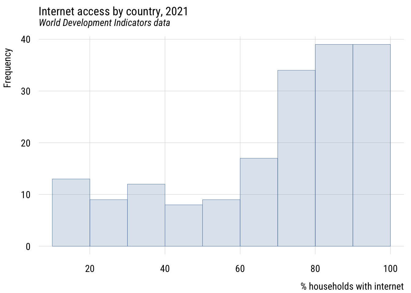
Show code
ggplot(d, aes(x = intpct)) +
  geom_histogram(bins = nclass.Sturges(d$intpct),
                 fill = tableau10[1], color = "white", alpha = 0.8) +
  labs(
    title = "Internet access by country, 2021",
    subtitle = "World Development Indicators data",
    x = "% households with internet",
    y = "Count")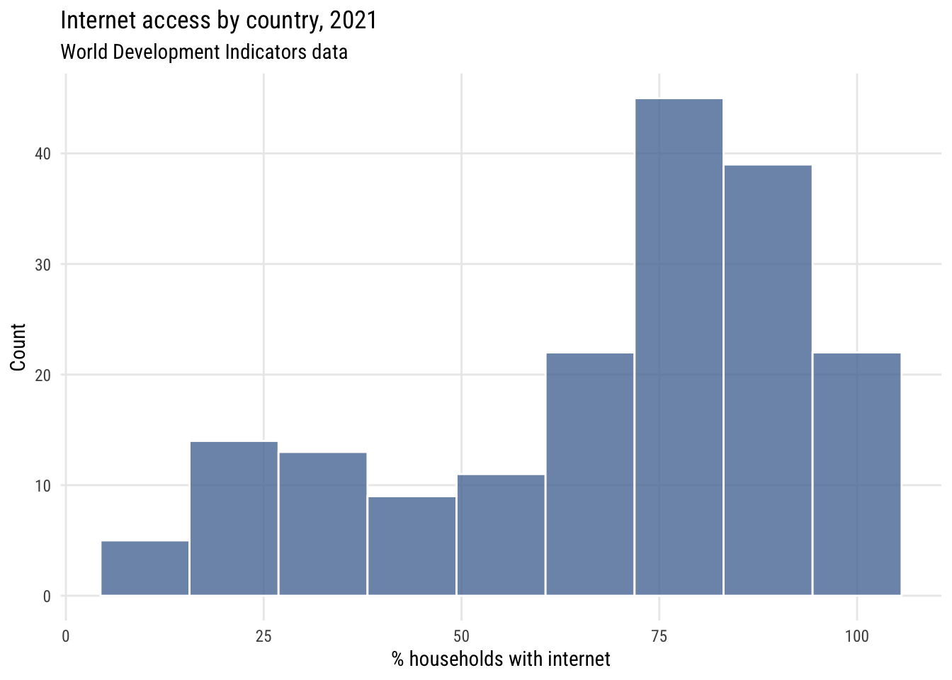
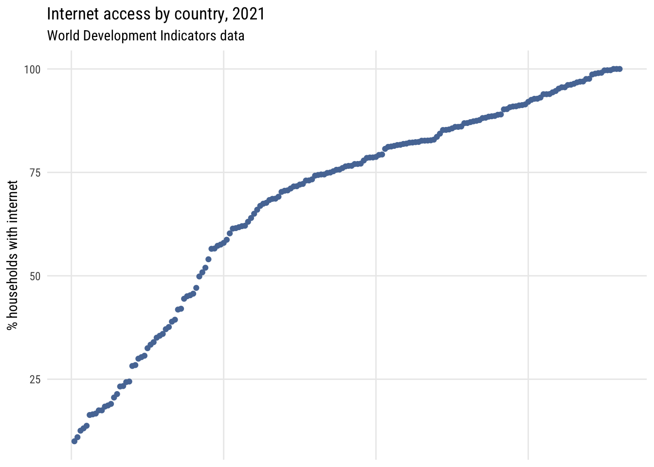
Here’s a dotplot with the countries sorted by rank.
Show code
plt(~ sort(intpct),
    data = d,
    main = "Internet access by country, 2021",
    sub = "World Development Indicators data",
    ylab = "% households with internet",
    xaxt = "n",
    xlab = "")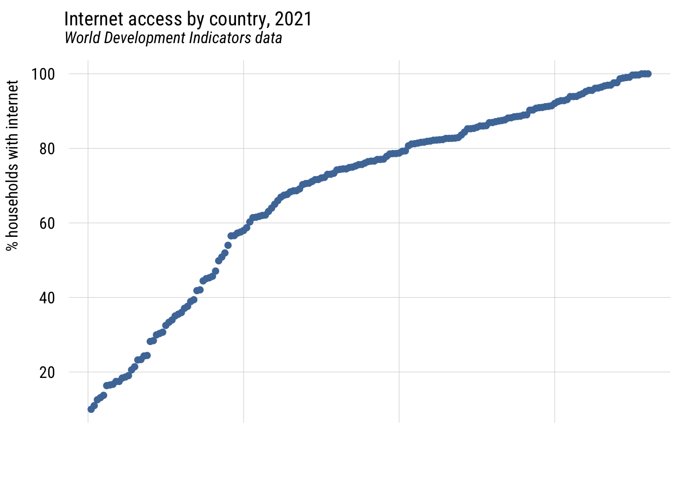
Show code
ggplot(d |> arrange(intpct) |> mutate(rank = row_number()),
       aes(x = rank, y = intpct)) +
  geom_point(color = tableau10[1]) +
  labs(
    title = "Internet access by country, 2021",
    subtitle = "World Development Indicators data",
    y = "% households with internet",
    x = NULL) +
  theme(axis.text.x = element_blank(),
        axis.ticks.x = element_blank())