pacman::p_load(dplyr,
               tidyr,
               broom,
               janitor,
               tinyplot,
ggplot2)Poisson and tables
Goals
To introduce Poisson regression and show how it can be used to analyze contingency table data.1
1 The book introduces the generalized linear model (GLM) in Chapter 15 in the context of logistic regression. But it makes sense to me to introduce Poisson right after categorical by categorical interactions because it allows us to think about the analysis of contingency tables.
Set up
Load packages and set themes as usual.
tinytheme("ipsum",
          family = "Roboto Condensed",
          palette.qualitative = "Tableau 10",
          palette.sequential = "agSunset")
# Match tinyplot ipsum style
theme_set(
theme_minimal(base_family = "Roboto Condensed") +
theme(panel.grid.minor = element_blank())
)
# Match Tableau 10 palette used by tinytheme (hex codes from ggthemes)
tableau10 <- c("#5778a4", "#e49444", "#d1615d", "#85b6b2", "#6a9f58",
"#e7ca60", "#a87c9f", "#f1a2a9", "#967662", "#b8b0ac")
options(
ggplot2.discrete.colour = \() scale_color_manual(values = tableau10),
ggplot2.discrete.fill = \() scale_fill_manual(values = tableau10)
)We will use the 2024 GSS data to illustrate.
d <- readRDS("data/gss2024.rds") |>
  haven::zap_labels() |>
  select(tvhours, degree, sex) |>
  drop_na() |>
  mutate(sex = factor(sex,
                      labels = c("M", "F")),        # sex as a factor
         degree_fac = factor(degree,
                             labels = c("none", "HS", "AA", "BA", "grad")))
Tables
If you’ve taken any stats before, you’ve probably seen the good old chi-square test. You generally use it to analyze categorical data (where none of the variables involved is continuous).
Let’s look at the contingency table of degree and sex in the 2024 GSS. We will use the janitor::tabyl() function as a more capable version of the base R table() function.
xtab <- d |>
  tabyl(sex, degree_fac)
xtab
sex none HS AA BA grad
M 66 471 66 212 130
F 117 516 120 260 186The good old chi-square test asks: are these two variables independent? It calculates this as follows:
\[ \chi^2 = \sum \frac{(O_i - E_i)^2}{E_i} \]
where \(i\) indexes table cells, \(O\) means “observed,” and \(E\) means “expected values if independent.”
We can do this easily in R.
xtab |>
  chisq.test(tabyl_results = TRUE)
    Pearson's Chi-squared test

data:  xtab
X-squared = 16.893, df = 4, p-value = 0.002027
This doesn’t seem like a “model”—because it’s not. But it turns out we can make it into a model. But we’ll need to first consider a new probability distribution.
Poisson models
Introduction to the Poisson distribution
You are, of course, familiar with the normal distribution. That’s the one we’ve been using the whole semester.
The Poisson distribution is a different distribution that is often used for count outcomes—that is, for integer variables that can’t go below zero.
Unlike the normal distribution, which assigns a probability density to all the real numbers from \(-\infty\) to \(\infty\), the Poisson distribution is a discrete probability distribution that assigns a finite probability to all positive integers using a a probability mass function.
Here’s the formula, though you probably won’t find it too useful yet.
\[ P(X = k) = \frac{\lambda^k e^{-\lambda}}{k!} \]
Unlike the normal distribution, which has two parameters (\(\mu\) and \(\sigma\)), the Poisson distribution just has one parameter: \(\lambda\). This number governs the shape of a given Poisson distribution and is both its mean and the variance.
Here are some examples:
Data prep
poisson_values <- expand_grid(
  lambda = c(1.5, 3.3, 7.1),
  x = 0:16) |>
  rowwise() |>
  mutate(prob = dpois(x, lambda = lambda))
Show code
plt(prob ~ x | factor(lambda),
    data = poisson_values,
    type = "b",
    xlab = "k",
    ylab = "P(X = k)",
    ylim = c(0, .35),
    lw = 2,
    xaxb = seq(0, 16, 2),
    grid = FALSE,
    legend = legend("topright", title = expression(lambda)),
    main = "Poisson example PMFs")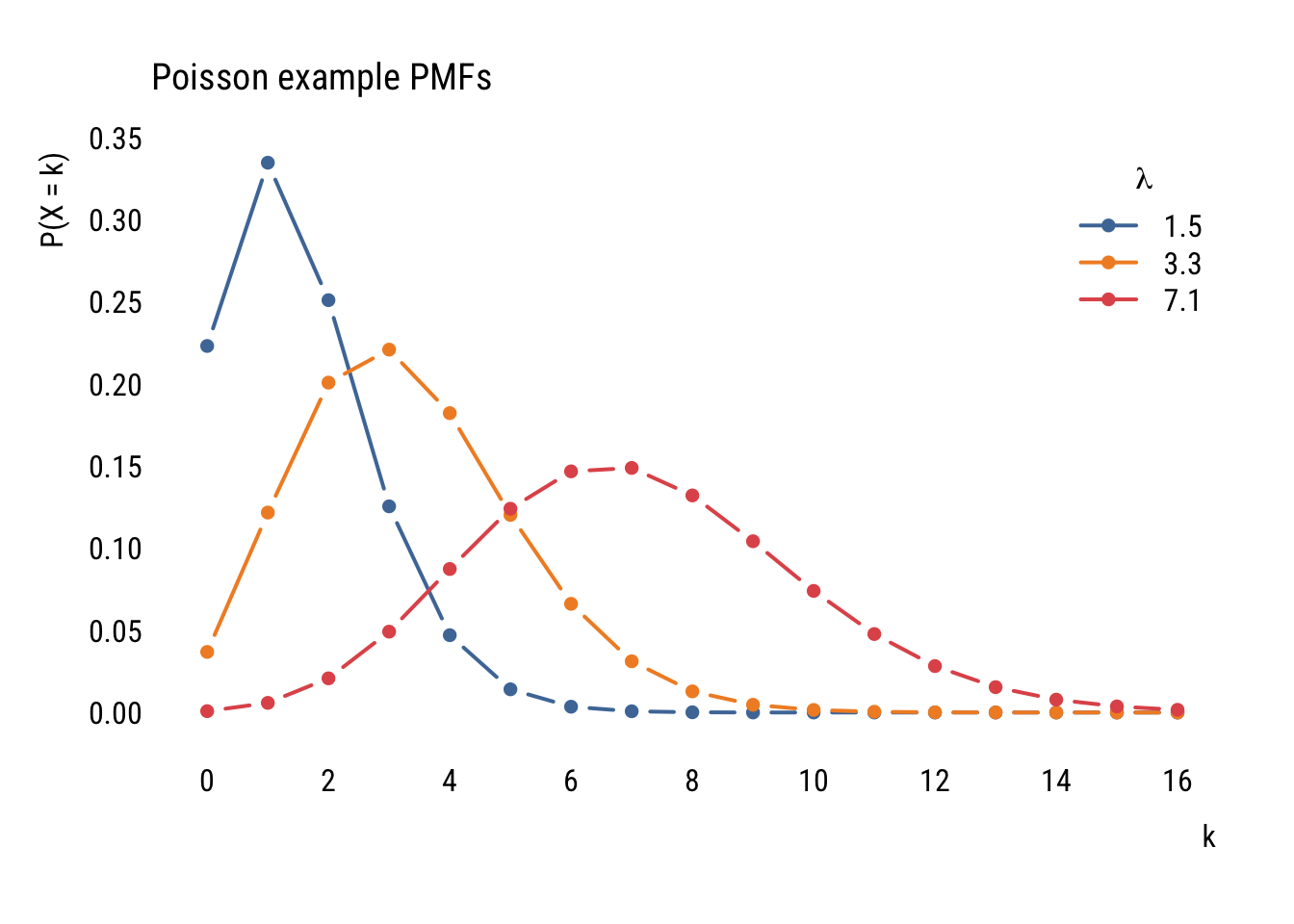
Even though the formula might look daunting at first, it’s pretty easy to find the probability of a certain count given a value of \(\lambda\). For example, if we ask “what’s the probability of having 5 job interviews if the mean number of interviews is 3.5 and the distribution follows a Poisson distribution?” we can do this:
(3.5^5 * exp(-3.5)) / factorial(5)[1] 0.1321686…which tells us that there’s an 13.2% chance of getting exactly 5 interviews.
We could also get that this way:
dpois(5, 3.5)[1] 0.1321686Or ask what is the probability of more than 5:
ppois(5, 3.5, lower.tail = FALSE)[1] 0.1423864You get the idea.
Modeling data
Before looking at predictors, we can think about how a variable could be modeled using the Poisson. First, let’s look at the unconditional distribution of tvhours in the GSS data.
Data prep
counts <- d |>
  count(tvhours) |>
  complete(tvhours = 0:24, fill = list(n = 0))
Show code
plt(n ~ tvhours,
    data = counts,
    type = "bar",
    xaxb = seq(0, 24, 2),
    grid = grid(nx = NA, ny = NULL, lty = "solid"))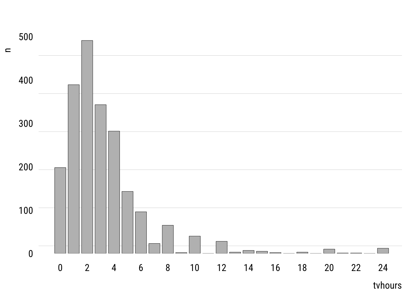
This shows the empirical distribution. The mean of tvhours is 3.3. A Poisson with \(\lambda =\) 3.3 looks like this.
Data prep
mean_tv <- mean(d$tvhours)

pois_dist <- tibble(
  k = 0:24,
  prob = dpois(k, mean_tv)
)
Show code
plt(prob ~ k,
    data = pois_dist,
    type = "bar",
    xaxb = seq(0, 24, 2),
    grid = grid(nx = NA, ny = NULL, lty = "solid"))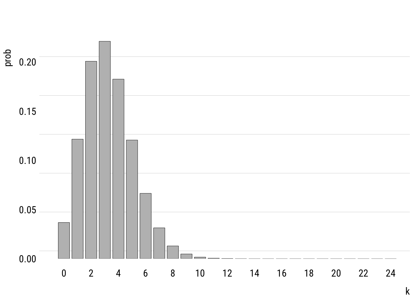
You can see that the modeled version is a simplified version of the empirical distribution. It doesn’t have as much probability mass out at the right tail, for example. It really doesn’t think that anyone is very likely to watch, say, 20 hours of TV per day.
Comparison to the normal distribution
We can compare the Poisson distribution of tvhours to a normal distribution with the mean and variance estimated from the data.
Data prep
mu <- mean(d$tvhours)
sigma <- sd(d$tvhours)

# cleaning up empirical distribution
empirical_dist <- counts |>
  mutate(prob = n / nrow(d)) |>
  rename(k = tvhours) |>
  complete(k = -6:24, fill = list(prob = 0))

# getting theoretical distriubtions
distributions <- tibble(
  k = -6:24,
  prob_Normal = dnorm(k, mu, sigma),
  prob_Poisson = dpois(k, mu))

# adjusting prob dens so it sums to 1 (it's already close)
normsum <- sum(distributions$prob_Normal)

# reshaping long for plotting
distributions <- distributions |>
  mutate(prob_Normal = prob_Normal / normsum) |>
  pivot_longer(starts_with("prob"),
               names_to = "dist",
               values_to = "prob",
               names_prefix = "prob_")
Show code
plt(prob ~ k | dist,
    data = distributions,
    type = "b",
    lw = .5,
    cex = 1,
    xaxb = seq(-6, 24, 2),
    ylim = c(0, .24),
    grid = NA,
    legend = legend("topright", title = "Distribution"))
plt_add(prob ~ k,
        data = empirical_dist,
        type = "h",
        alpha = .3,
        lw = 8,
        col = "gray")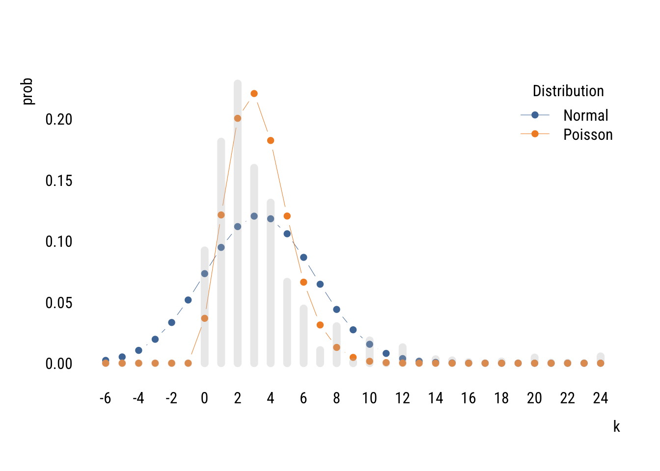
You can see that two distributions estimated on the same data allocate the probability mass in very different places, with the normal putting a lot of it below zero (which is technically impossible of course).
The Poisson isn’t perfect either. It doesn’t expect as many low values or high values as there actually are. This is because the Poisson assumes that the mean and variance of the distribution are the same. But in the empirical distribution, the mean is 3.3 and the variance is 10.9. It is actually common for empirical count data to be overdispersed relative what the Poisson expects.2
2 There are many things that lead to overdispersion, including different subpopulations (e.g., old and young), clustering (e.g., watching an hour of TV makes watching another hour more likely), and excess zeros (maybe some people have no chance of watching any TV). There are ways to address these issues (like negative binomial regression and zero-inflated Poisson) but I’m already on too big of a tangent.
We could compare the likelihoods of these two distributions.
norm_tv <- lm(tvhours ~ 1, data = d)
pois_tv <- glm(tvhours ~ 1, data = d, family = poisson())

logLik(norm_tv)
'log Lik.' -5603.863 (df=2)logLik(pois_tv)'log Lik.' -5589.428 (df=1)Even using only one parameter, the Poisson does a better job of fitting the unconditional empirical distribution.
Models with predictors
Of course we are usually going to want to create models with predictors. We can write a Poisson model with one predictor like this:
\[\begin{align} y_i &\sim \text{Poisson}(\lambda_i) \\ \log(\lambda_i) &= \beta_0 + \beta_1 x_i \end{align}\]
We could also write the second part like this:
\[ \lambda_i = e^{\beta_0} e^{\beta_1 x_i} \]
Or like this:
\[ \lambda_i = e^{\beta_0 + \beta_1 x_i} \]
All of the ways of writing nudge you toward different intuition.
Here’s an example estimation.
m1 <- glm(tvhours ~ sex,
          data = d,
          family = poisson())
summary(m1)
Call:
glm(formula = tvhours ~ sex, family = poisson(), data = d)

Coefficients:
            Estimate Std. Error z value Pr(>|z|)
(Intercept)  1.16678    0.01815   64.28   <2e-16 ***
sexF         0.04995    0.02401    2.08   0.0375 *
---
Signif. codes:  0 '***' 0.001 '**' 0.01 '*' 0.05 '.' 0.1 ' ' 1

(Dispersion parameter for poisson family taken to be 1)

    Null deviance: 5472.7  on 2143  degrees of freedom
Residual deviance: 5468.4  on 2142  degrees of freedom
AIC: 11179

Number of Fisher Scoring iterations: 5
From this we see that female respondents report watching 1.051 times more TV than male respondents.
The summary() output also suggests that this difference is “statistically significant” at the .05 level. But we have to be careful here. Remember that the Poisson assumes that the mean and variance of the distribution are the same. But since the data are likely overdispersed (as we discussed above), the standard errors are probably actually bigger than estimated.
We can estimate correct standard errors using the code below. This is a “robust” SE because it’s robust (among other things) to a violation of the assumption that (conditional) mean and variance are the same.
lmtest::coeftest(m1,
                 vcov = sandwich::vcovHC(m1, type = "HC3"))
z test of coefficients:

            Estimate Std. Error z value Pr(>|z|)
(Intercept) 1.166782   0.032851 35.5173   <2e-16 ***
sexF        0.049953   0.043608  1.1455    0.252
---
Signif. codes:  0 '***' 0.001 '**' 0.01 '*' 0.05 '.' 0.1 ' ' 1
We can see that the robust standard error is quite a bit larger. This reminds me of part of a funny haiku by Keisuke Hirano:
T-stat looks too good.
Use robust standard errors—
Significance gone.
Models for tables
OK now with all this in hand we can finally get back to thinking about how models can be tables. Remember this?
Show code
xtab sex none HS AA BA grad
M 66 471 66 212 130
F 117 516 120 260 186What if instead we reshaped it into dataframe like this so that it has 10 rows?
Show code
dcounts <- d |>
  summarize(freq = n(),
            .by = c(degree_fac, sex)) |>
  arrange(sex, degree_fac)

dcounts
# A tibble: 10 × 3
degree_fac sex freq
<fct> <fct> <int>
1 none M 66
2 HS M 471
3 AA M 66
4 BA M 212
5 grad M 130
6 none F 117
7 HS F 516
8 AA F 120
9 BA F 260
10 grad F 186We can now model the count of cases in each cell (freq) as some function of the two categorical variables, degree_fac and sex.
Let’s build up slowly. Think about what the model below would mean.
tm_null <- glm(freq ~ 1,
               data = dcounts,
               family = poisson())
It assumes that freq would be the same in all 10 cells. We can confirm this as follows3:
3 We have to specify option type = "response" in the predict() function because without it we’ll get the prediction in log counts because that’s how the model thinks. This options says “we want it in the original units.”
dcounts <- dcounts |>
  mutate(pred_null = predict(tm_null, type = "response"))
dcounts
# A tibble: 10 × 4
degree_fac sex freq pred_null
<fct> <fct> <int> <dbl>
1 none M 66 214.
2 HS M 471 214.
3 AA M 66 214.
4 BA M 212 214.
5 grad M 130 214.
6 none F 117 214.
7 HS F 516 214.
8 AA F 120 214.
9 BA F 260 214.
10 grad F 186 214.This model would all the male and female cells to have different counts:
tm_sex <- glm(freq ~ sex,
              data = dcounts,
              family = poisson())
dcounts <- dcounts |>
mutate(pred_sex = predict(tm_sex, type = "response"))
dcounts# A tibble: 10 × 5
degree_fac sex freq pred_null pred_sex
<fct> <fct> <int> <dbl> <dbl>
1 none M 66 214. 189.
2 HS M 471 214. 189.
3 AA M 66 214. 189.
4 BA M 212 214. 189.
5 grad M 130 214. 189.
6 none F 117 214. 240.
7 HS F 516 214. 240.
8 AA F 120 214. 240.
9 BA F 260 214. 240.
10 grad F 186 214. 240.This is a little better but not matching freq very well! Let’s add degree also:
tm_both <- glm(freq ~ sex + degree_fac,
               data = dcounts,
               family = poisson())
dcounts <- dcounts |>
mutate(pred_both = predict(tm_both, type = "response"))
dcounts# A tibble: 10 × 6
degree_fac sex freq pred_null pred_sex pred_both
<fct> <fct> <int> <dbl> <dbl> <dbl>
1 none M 66 214. 189. 80.7
2 HS M 471 214. 189. 435.
3 AA M 66 214. 189. 82.0
4 BA M 212 214. 189. 208.
5 grad M 130 214. 189. 139.
6 none F 117 214. 240. 102.
7 HS F 516 214. 240. 552.
8 AA F 120 214. 240. 104.
9 BA F 260 214. 240. 264.
10 grad F 186 214. 240. 177. This is closer but not quite there. Why? Because it assumes that sex can affect the number of people in a cell and degree can affect the number of people in a cell but they don’t influence each other’s effects! Let’s take a closer look:
summary(tm_both)
Call:
glm(formula = freq ~ sex + degree_fac, family = poisson(), data = dcounts)

Coefficients:
               Estimate Std. Error z value Pr(>|z|)
(Intercept)     4.39024    0.07782  56.414  < 2e-16 ***
sexF            0.23806    0.04350   5.473 4.43e-08 ***
degree_facHS    1.68518    0.08048  20.938  < 2e-16 ***
degree_facAA    0.01626    0.10412   0.156    0.876
degree_facBA    0.94749    0.08708  10.881  < 2e-16 ***
degree_facgrad  0.54626    0.09289   5.881 4.09e-09 ***
---
Signif. codes:  0 '***' 0.001 '**' 0.01 '*' 0.05 '.' 0.1 ' ' 1

(Dispersion parameter for poisson family taken to be 1)

    Null deviance: 968.245  on 9  degrees of freedom
Residual deviance:  17.065  on 4  degrees of freedom
AIC: 98.797

Number of Fisher Scoring iterations: 4
This model says that cells from female respondents have 0.238 more log respondents in them. If we exponentiate that, we see that female cells have 1.27 times more respondents in them compared to the corresponding male cell. You can confirm that by comparing the predictions above.
This is the same as assuming independence—that education and sex have nothing to do with each other. These predictions are the same as the expected values in the \(\chi^2\)-test at the very beginning of this section.
Note that this model only uses 6 degrees of freedom—intercept, female dummy, four education dummies—to represent a table with 10 cells. So it’s an attempt to approximate 10 numbers with 6 numbers.
We can get the full table—what we call the saturated model—by allowing the factors to interact:
tm_sat <- glm(freq ~ sex * degree_fac,
              data = dcounts,
              family = poisson())
dcounts <- dcounts |>
mutate(pred_sat = predict(tm_sat, type = "response"))
dcounts# A tibble: 10 × 7
degree_fac sex freq pred_null pred_sex pred_both pred_sat
<fct> <fct> <int> <dbl> <dbl> <dbl> <dbl>
1 none M 66 214. 189. 80.7 66.0
2 HS M 471 214. 189. 435. 471.
3 AA M 66 214. 189. 82.0 66.0
4 BA M 212 214. 189. 208. 212.
5 grad M 130 214. 189. 139. 130.
6 none F 117 214. 240. 102. 117.
7 HS F 516 214. 240. 552. 516.
8 AA F 120 214. 240. 104. 120.
9 BA F 260 214. 240. 264. 260.
10 grad F 186 214. 240. 177. 186. You can see that the model “predictions” are exactly the same as the data. This is because we used 10 parameters to recover 10 cell counts.
If we compare the saturated model to the independence model, we are asking the same question as the old-school \(\chi^2\) test4.
4 As the sample goes to infinity, the likelihood ratio \(\chi2\) test and the Pearson’s \(\chi^2\) test are the same. But in finite samples, we have to use Rao’s score test to get the exact same values from anova().
anova(tm_both, tm_sat, test = "Rao")Analysis of Deviance Table
Model 1: freq ~ sex + degree_fac
Model 2: freq ~ sex * degree_fac
Resid. Df Resid. Dev Df Deviance Rao Pr(>Chi)
1 4 17.065
2 0 0.000 4 17.065 16.893 0.002027 **
---
Signif. codes: 0 '***' 0.001 '**' 0.01 '*' 0.05 '.' 0.1 ' ' 1Compare to the original:
xtab |> chisq.test()
    Pearson's Chi-squared test

data:  xtab
X-squared = 16.893, df = 4, p-value = 0.002027
And that is how even tables can be models!
Coda
These loglinear models for tables were actually super important for sociology in the 1970s and 1980s. You don’t see them much anymore, but we will look at a 2006 example in class.