pacman::p_load(dplyr,
               tidyr,
               broom,
               stringr,
               tinyplot,
ggplot2)Chapter 3
Goals
We will use simulations to understand sampling distributions. This is a supplement to the more theory-based discussion in the book.
Set up
Load packages and set theme.
tinytheme("ipsum",
          family = "Roboto Condensed",
          palette.qualitative = "Tableau 10",
palette.sequential = "agSunset")theme_set(
theme_minimal(base_family = "Roboto Condensed") +
theme(panel.grid.minor = element_blank())
)
tableau10 <- c("#5778a4", "#e49444", "#d1615d", "#85b6b2", "#6a9f58",
"#e7ca60", "#a87c9f", "#f1a2a9", "#967662", "#b8b0ac")
options(
ggplot2.discrete.colour = \() scale_color_manual(values = tableau10),
ggplot2.discrete.fill = \() scale_fill_manual(values = tableau10)
)Get data1.
1 I showed how to download this dataset in the Chapter 2 notes.
gss2024 <- readRDS(file = here::here("data", "gss2024.rds")) |>
  haven::zap_labels()
Sampling distributions
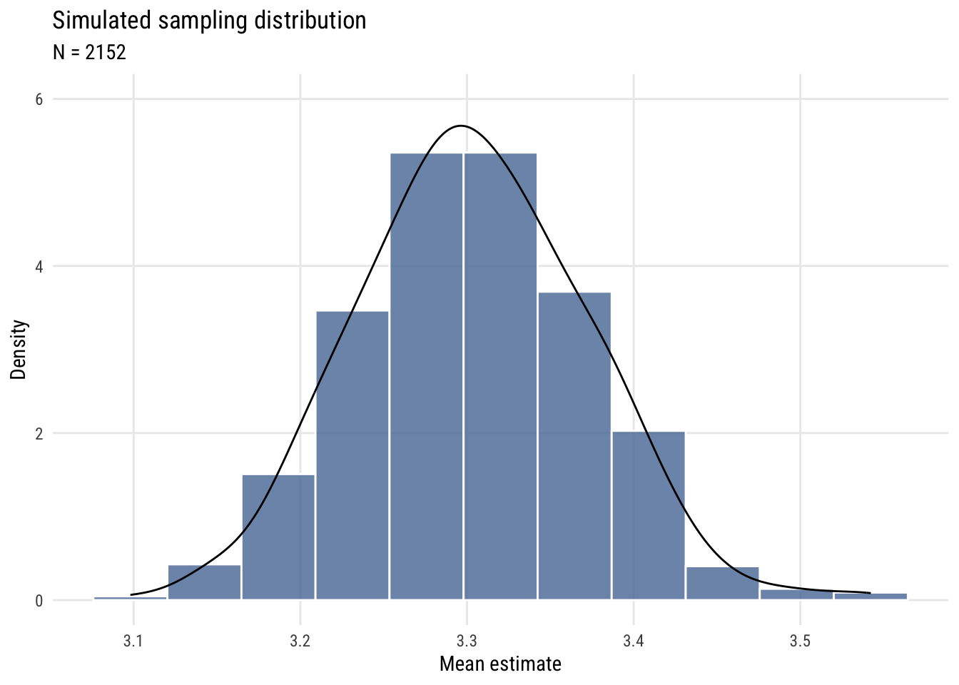
We need some skewed data to show that we get a normal sampling distribution for the mean (with a big enough sample) no matter what the shape of the underlying distribution. We’ll use the GSS classic, tvhours.
d <- gss2024 |>
  select(tvhours) |>
drop_na()Show code
plt(~ tvhours,
    data = d,
    type = type_hist(breaks = seq(-.5, 24.5, 1)),
    main = "Daily hours of television among US adults",
    sub = "2024 General Social Survey",
    xaxt = "n",
    xlim = c(-.6, 24.6))
axis(1, at = seq(0, 24, 4),
     labels = seq(0, 24, 4),
     tck = 0,
     lwd = 0)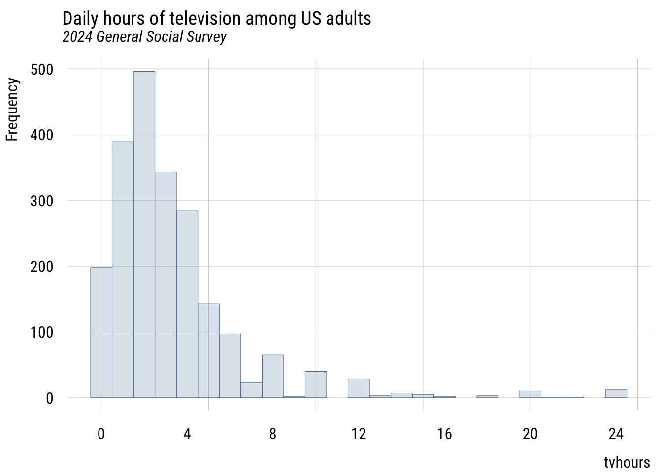
Show code
ggplot(d, aes(x = tvhours)) +
  geom_histogram(breaks = seq(-.5, 24.5, 1),
                 fill = tableau10[1], color = "white", alpha = 0.8) +
  scale_x_continuous(breaks = seq(0, 24, 4), limits = c(-.6, 24.6)) +
  labs(
    title = "Daily hours of television among US adults",
    subtitle = "2024 General Social Survey",
    x = "tvhours",
    y = "Count")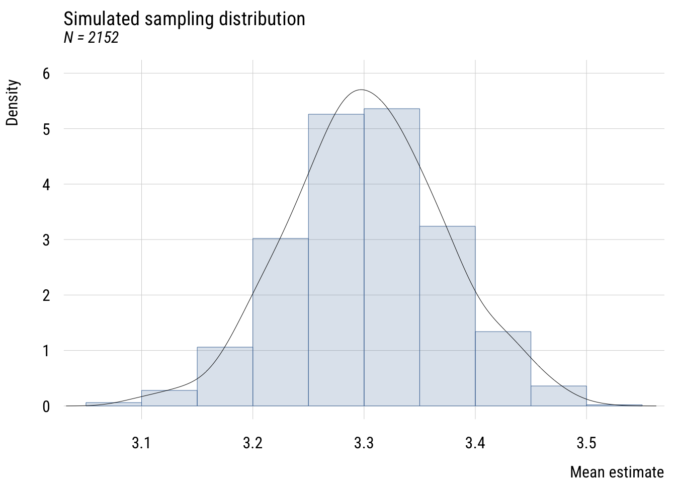
Consider this sample a population for now and take repeated samples from it. First step is to write a function that grabs a sample and computes the mean.
get_sample_mean <- function(n) {

  d |>
    slice_sample(n = n, replace = TRUE) |>
    summarize(m = mean(tvhours)) |>
    as.numeric()

}
Now I like to make a simulation “skeleton” that I can plug results into.
sims <- tibble(
  sim_number = 1:1000
)
Now I add the sampled means to the skeleton. If you’re trying this at home, it’s good to vary the sample size so you can see how the simulated sampling distribution behaves.
sims <- sims |>
  rowwise() |> # do separately by row
  mutate(m = get_sample_mean(n = 2152)) # vary the N
Now I can plot the results.
Show code
plt(~ m,
    data = sims,
    type = type_hist(breaks = "Sturges", freq = FALSE),
    ylim = c(0, 6),
    main = "Simulated sampling distribution",
    sub = "N = 2152",
    ylab = "Density",
    xlab = "Mean estimate")
plt_add(~ m,
        data = sims,
        type = type_density(bw = "SJ"),
        col = "black")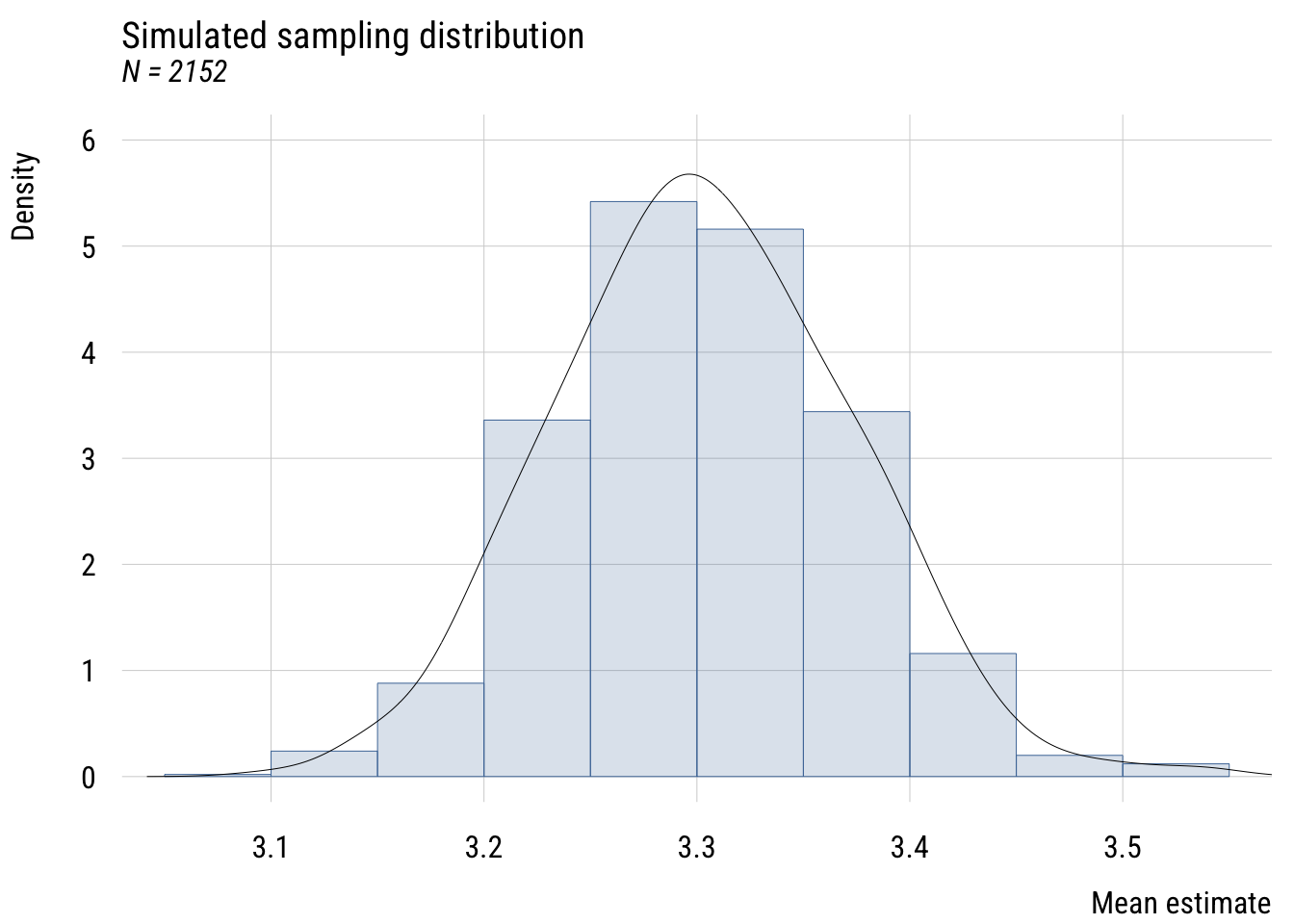
Show code
ggplot(sims, aes(x = m)) +
  geom_histogram(aes(y = after_stat(density)),
                 bins = nclass.Sturges(sims$m),
                 fill = tableau10[1], color = "white", alpha = 0.8) +
  geom_density(bw = "SJ", color = "black") +
  coord_cartesian(ylim = c(0, 6)) +
  labs(
    title = "Simulated sampling distribution",
    subtitle = "N = 2152",
    y = "Density",
    x = "Mean estimate")